You are viewing a plain text version of this content. The canonical link for it is here.
Posted to commits@weex.apache.org by ta...@apache.org on 2017/08/22 07:19:27 UTC
[1/2] incubator-weex git commit: * [ios] add doc about transition
Repository: incubator-weex
Updated Branches:
refs/heads/dev ee892fb32 -> 28fe94890
* [ios] add doc about transition
Project: http://git-wip-us.apache.org/repos/asf/incubator-weex/repo
Commit: http://git-wip-us.apache.org/repos/asf/incubator-weex/commit/840f6f7c
Tree: http://git-wip-us.apache.org/repos/asf/incubator-weex/tree/840f6f7c
Diff: http://git-wip-us.apache.org/repos/asf/incubator-weex/diff/840f6f7c
Branch: refs/heads/dev
Commit: 840f6f7cf5d1bcdad37db81b29dbf8743992f617
Parents: a52c861
Author: doumafang <do...@gmail.com>
Authored: Thu Aug 17 13:58:34 2017 +0800
Committer: doumafang <do...@gmail.com>
Committed: Thu Aug 17 15:00:30 2017 +0800
----------------------------------------------------------------------
doc/source/cn/references/common-style.md | 59 +++++++++++++++++++++-
doc/source/cn/references/modules/animation.md | 41 +++++++--------
doc/source/references/common-style.md | 57 +++++++++++++++++++++
doc/source/references/modules/animation.md | 46 ++++++++---------
4 files changed, 159 insertions(+), 44 deletions(-)
----------------------------------------------------------------------
http://git-wip-us.apache.org/repos/asf/incubator-weex/blob/840f6f7c/doc/source/cn/references/common-style.md
----------------------------------------------------------------------
diff --git a/doc/source/cn/references/common-style.md b/doc/source/cn/references/common-style.md
index a36d2cd..9092066 100644
--- a/doc/source/cn/references/common-style.md
+++ b/doc/source/cn/references/common-style.md
@@ -339,6 +339,63 @@ transform 属性向元素应用 2D 转换。该属性允许我们对元素进行
</style>
```
+
+
+## transition <span class="api-version">v0.16.0+</span>
+
+现在您可以在CSS中使用transition属性来提升您应用的交互性与视觉感受,transition中包括布局动画,即LayoutAnimation,现在布局产生变化的同时也能使用transition带来的流畅动画。transition允许CSS的属性值在一定的时间区间内平滑地过渡。
+
+### 参数
+
+- ``transition-property``:允许过渡动画的属性名,设置不同样式transition效果的键值对,默认值为空,表示不执行任何transition,下表列出了所有合法的参数属性:
+
+ | 参数名 | 描述 |
+ | --------------- | ------------------------------ |
+ | width | transition过渡执行的时候是否组件的宽度参与动画 |
+ | height | transition过渡执行的时候是否组件的高度参与动画 |
+ | top | transition过渡执行的时候是否组件的顶部距离参与动画 |
+ | bottom | transition过渡执行的时候是否组件的底部距离参与动画 |
+ | left | transition过渡执行的时候是否组件的左侧距离参与动画 |
+ | right | transition过渡执行的时候是否组件的右侧距离参与动画 |
+ | backgroundColor | transition过渡执行的时候是否组件的背景颜色参与动画 |
+ | opacity | transition过渡执行的时候是否组件的不透明度参与动画 |
+ | transform | transition过渡执行的时候是否组件的变换类型参与动画 |
+
+- ``transition-duration``:指定transition过渡的持续时间 (单位是毫秒),默认值是 `0`,表示没有动画效果。
+
+- ``transition-delay``:指定请求transition过渡操作到执行transition过渡之间的时间间隔 (单位是毫秒或者秒),默认值是 `0`,表示没有延迟,在请求后立即执行transition过渡。
+
+- ``transition-timing-function``:描述transition过渡执行的速度曲线,用于使transition过渡更为平滑。默认值是 `ease`。下表列出了所有合法的属性:
+
+ | 属性名 | 描述 |
+ | ------------------------------ | ---------------------------------------- |
+ | ``ease`` | transition过渡逐渐变慢的过渡效果 |
+ | `ease-in` | transition过渡慢速开始,然后变快的过渡效果 |
+ | `ease-out` | transition过渡快速开始,然后变慢的过渡效果 |
+ | `ease-in-out` | transition过渡慢速开始,然后变快,然后慢速结束的过渡效果 |
+ | `linear` | transition过渡以匀速变化 |
+ | `cubic-bezier(x1, y1, x2, y2)` | 使用三阶贝塞尔函数中自定义transition变化过程,函数的参数值必须处于 0 到 1 之间。更多关于三次贝塞尔的信息请参阅 [cubic-bezier](http://cubic-bezier.com/) 和 [Bézier curve](https://en.wikipedia.org/wiki/B%C3%A9zier_curve). |
+
+### 示例
+
+```
+<style scoped>
+ .panel {
+ margin: 10px;
+ top:10px;
+ align-items: center;
+ justify-content: center;
+ border: solid;
+ border-radius: 10px;
+
+ transition-property: width,height,backgroundColor;
+ transition-duration: 0.3s;
+ transition-delay: 0s;
+ transition-timing-function: cubic-bezier(0.25, 0.1, 0.25, 1.0);
+ }
+</style>
+```
+
## 伪类 <span class="api-version">v0.9.5+</span>
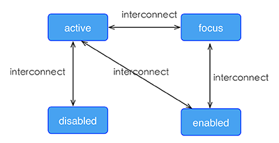
Weex 支持四种伪类:`active`, `focus`, `disabled`, `enabled`
@@ -355,7 +412,7 @@ Weex 支持四种伪类:`active`, `focus`, `disabled`, `enabled`
-### Example
+### 示例
```html
<template>
http://git-wip-us.apache.org/repos/asf/incubator-weex/blob/840f6f7c/doc/source/cn/references/modules/animation.md
----------------------------------------------------------------------
diff --git a/doc/source/cn/references/modules/animation.md b/doc/source/cn/references/modules/animation.md
index 38f9bec..882a455 100644
--- a/doc/source/cn/references/modules/animation.md
+++ b/doc/source/cn/references/modules/animation.md
@@ -21,34 +21,35 @@ version: 2.1
* `options.delay {number}`:指定请求动画操作到执行动画之间的时间间隔 (单位是毫秒),默认值是 `0`,表示没有延迟,在请求后立即执行动画。
* `options.timingFunction {string}`:描述动画执行的速度曲线,用于使动画变化更为平滑。默认值是 `linear`,表示动画从开始到结束都拥有同样的速度。下表列出了所有合法的属性:
-| 属性名 | 描述 | 示例 |
-| ---- | ---- | ---- |
-| `linear` | 动画从头到尾的速度是相同的 |
-| `ease-in` | 动画速度由慢到快 |
-| `ease-out` | 动画速度由快到慢 |
-| `ease-in-out` | 动画先加速到达中间点后减速到达终点 |
-| `cubic-bezier(x1, y1, x2, y2)` | 在三次贝塞尔函数中定义变化过程,函数的参数值必须处于 0 到 1 之间。更多关于三次贝塞尔的信息请参阅 [cubic-bezier](http://cubic-bezier.com/) 和 [Bézier curve](https://en.wikipedia.org/wiki/B%C3%A9zier_curve). |
+| 属性名 | 描述 | 示例 |
+| ------------------------------ | ---------------------------------------- | ---- |
+| `linear` | 动画从头到尾的速度是相同的 | |
+| `ease-in` | 动画速度由慢到快 | |
+| `ease-out` | 动画速度由快到慢 | |
+| `ease-in-out` | 动画先加速到达中间点后减速到达终点 | |
+| `cubic-bezier(x1, y1, x2, y2)` | 在三次贝塞尔函数中定义变化过程,函数的参数值必须处于 0 到 1 之间。更多关于三次贝塞尔的信息请参阅 [cubic-bezier](http://cubic-bezier.com/) 和 [Bézier curve](https://en.wikipedia.org/wiki/B%C3%A9zier_curve). | |
* `options.styles {Object}`:设置不同样式过渡效果的键值对,下表列出了所有合法的参数:
-| 参数名 | 描述 | 值类型 | 默认值 | 示例 |
-| ---- | ---- | ---- | ---- |---- |
-| width | 动画执行后应用到组件上的宽度值 | length | 无 |
-| height | 动画执行后应用到组件上的高度值 | length | 无 |
-| backgroundColor | 动画执行后应用到组件上的背景颜色 | string | none |
-| opacity | 动画执行后应用到组件上的不透明度值 | 介于 0 到 1 间的数值 | `1` |
-| transformOrigin | 定义变化过程的中心点. 参数 `x-aris` 可能的值为 `left`、`center`、`right`、长度值或百分比值, 参数 `y-axis` 可能的值为 `top`、`center`、`bottom`、长度值或百分比值 | `x-axis y-axis` | `center center` |
-| transform | 定义应用在元素上的变换类型,支持下表列出的属性 | object | 无 |
+| 参数名 | 描述 | 值类型 | 默认值 | 示例 |
+| --------------- | ---------------------------------------- | --------------- | --------------- | ---- |
+| width | 动画执行后应用到组件上的宽度值 | length | 无 | |
+| height | 动画执行后应用到组件上的高度值 | length | 无 | |
+| backgroundColor | 动画执行后应用到组件上的背景颜色 | string | none | |
+| opacity | 动画执行后应用到组件上的不透明度值 | 介于 0 到 1 间的数值 | `1` | |
+| transformOrigin | 定义变化过程的中心点. 参数 `x-aris` 可能的值为 `left`、`center`、`right`、长度值或百分比值, 参数 `y-axis` 可能的值为 `top`、`center`、`bottom`、长度值或百分比值 | `x-axis y-axis` | `center center` | |
+| transform | 定义应用在元素上的变换类型,支持下表列出的属性 | object | 无 | |
`transform`属性的合法值:
-| 名称 | 描述 | 值类型 | 默认值 | 示例 |
-| ---- | ---- | ---- | ---- | ---- |
-| `translate`/`translateX`/`translateY` | 指定元素要移动到的位置 | 像素值或百分比 | 无 |
-| `rotate` | 指定元素将被旋转的角度,单位是度 | number | 无 |
-| `scale`/`scaleX`/`scaleY` | 按比例放大或缩小元素 | number | 无 |
+| 名称 | 描述 | 值类型 | 默认值 | 示例 |
+| ------------------------------------- | ---------------- | ------- | ---- | ---- |
+| `translate`/`translateX`/`translateY` | 指定元素要移动到的位置 | 像素值或百分比 | 无 | |
+| `rotate` | 指定元素将被旋转的角度,单位是度 | number | 无 | |
+| `scale`/`scaleX`/`scaleY` | 按比例放大或缩小元素 | number | 无 | |
* `callback {Function}`:动画执行完毕之后的回调
+* `needLayout(boolean)`:节点动画执行时是否产生布局动画即LayoutAnimation
## Example
http://git-wip-us.apache.org/repos/asf/incubator-weex/blob/840f6f7c/doc/source/references/common-style.md
----------------------------------------------------------------------
diff --git a/doc/source/references/common-style.md b/doc/source/references/common-style.md
index 4250fec..3556fb6 100644
--- a/doc/source/references/common-style.md
+++ b/doc/source/references/common-style.md
@@ -228,6 +228,63 @@ Currently supported format:
</style>
```
+## transition <span class="api-version">v0.16.0+</span>
+
+Now you can use the transition attribute in CSS to enhance the interactivity and visual experience of your application. The transition includes the layout animation, that is, LayoutAnimation, which now changes the layout and uses the fluent animation of the transition. Transition allows the CSS attribute values to transition smoothly over a certain time interval.
+
+### Property
+
+- ``transition-property``:Allows the name of the transitional animation to set the value of the different styles transition effect, the default value is empty, that does not perform any transition, the following table lists all the legitimate parameters of the property:
+
+ | Property | Description |
+ | --------------- | ---------------------------------------- |
+ | width | The transition is performed when the width of the component is involved in the animation |
+ | height | The transition is performed when the height of the component is involved in the animation |
+ | top | The transition is performed when the top of the component is involved in the animation |
+ | bottom | The transition is performed when the bottom of the component is involved in the animation |
+ | left | The transition is performed when the left of the component is involved in the animation |
+ | right | The transition is performed when the right of the component is involved in the animation |
+ | backgroundColor | The transition is performed when the backgroundColor of the component is involved in the animation |
+ | opacity | The transition is performed when the opacity of the component is involved in the animation |
+ | transform | The transition is performed when the transform of the component is involved in the animation |
+
+- ``transition-duration``:Specifies the duration of the transition transition (in milliseconds). The default value is 0, indicating that there is no animation.
+
+- ``transition-delay``:Specifies the time interval (in milliseconds or seconds) between the request transition transition and the transition transition. The default value is 0, indicating that there is no delay, and the transition transition is performed immediately after the request.
+
+- ``transition-timing-function``:Describes the velocity curve of the transition transition, which is used to make the transition transition smoother. The default is ease. The following table lists all the valid attributes:
+
+ | Property | Description |
+ | ------------------------------ | ---------------------------------------- |
+ | ``ease`` | The transition gradually slow down the transition effect |
+| `ease-in` | The transition starts slowly and then becomes faster for the transition effect |
+| `ease-out` | The transition starts quickly and then slows the transition effect |
+| `ease-in-out` | The transition starts slowly, then goes fast and then slowly ends the transition effect |
+| `linear` | The transition changes at constant speed |
+| `cubic-bezier(x1, y1, x2, y2)` | Using the custom transition in the third-order Bessel function, the parameter values of the function must be between 0 and 1. For more information on three times Bessel, see [cubic-bezier](http://cubic-bezier.com/) and [Bézier curve](https://en.wikipedia.org/wiki/B%C3%A9zier_curve). |
+
+### Example
+
+```
+<style scoped>
+ .panel {
+ margin: 10px;
+ top:10px;
+ align-items: center;
+ justify-content: center;
+ border: solid;
+ border-radius: 10px;
+
+ transition-property: width,height,backgroundColor;
+ transition-duration: 0.3s;
+ transition-delay: 0s;
+ transition-timing-function: cubic-bezier(0.25, 0.1, 0.25, 1.0);
+ }
+</style>
+```
+
+
+
## Pseudo class <span class="api-version">v0.9.5+</span>
Weex support four pseudo-classes: `active`, `focus`, `disabled`, `enabled`
http://git-wip-us.apache.org/repos/asf/incubator-weex/blob/840f6f7c/doc/source/references/modules/animation.md
----------------------------------------------------------------------
diff --git a/doc/source/references/modules/animation.md b/doc/source/references/modules/animation.md
index 29de02b..539191f 100644
--- a/doc/source/references/modules/animation.md
+++ b/doc/source/references/modules/animation.md
@@ -28,37 +28,37 @@ Smooth and meaningful animation is very effective for enhancing the user experie
- `delay` (number): Specifies the amount of milliseconds to wait between a change being requested to a property that is to be transitioned and the start of the transition effect. The default value is `0`.
- `timingFunction` (string): Used to describe how the intermediate values of the styles being affected by a transition effect are calculated, default value is `linear`, the allowed attributes are listed in the following table:
-|name|description|example|
-|:--|:--|:--|
-|`linear`|Specifies a transition effect with the same speed from start to end|
-|`ease-in`|Specifies a transition effect with a slow start|
-|`ease-out`|Specifies a transition effect with a slow end|
-|`ease-in-out`|Specifies a transition effect with a slow start and end|
-|`cubic-bezier(x1, y1, x2, y2)`|Define your own values in the cubic-bezier function. Possible values are parameter values from 0 to 1. More information about cubic-bezier please visit [cubic-bezier](http://cubic-bezier.com/) and [Bézier curve](https://en.wikipedia.org/wiki/B%C3%A9zier_curve).|
+| name | description | example |
+| :----------------------------- | :--------------------------------------- | :------ |
+| `linear` | Specifies a transition effect with the same speed from start to end | |
+| `ease-in` | Specifies a transition effect with a slow start | |
+| `ease-out` | Specifies a transition effect with a slow end | |
+| `ease-in-out` | Specifies a transition effect with a slow start and end | |
+| `cubic-bezier(x1, y1, x2, y2)` | Define your own values in the cubic-bezier function. Possible values are parameter values from 0 to 1. More information about cubic-bezier please visit [cubic-bezier](http://cubic-bezier.com/) and [Bézier curve](https://en.wikipedia.org/wiki/B%C3%A9zier_curve). | |
- `styles` (object): Specify the names and values of styles to which a transition effect should be applied. The allowed attributes are listed in the following table:
-| name | description | value type | default value |example|
-| :--- | :--- | :--- | :--- |:---|
-|width|The width applied to the component after the animation finished.|length|none|
-|height|The height applied to the component after the animation finished.|length|none|
-|backgroundColor|The background color applied to the component after the animation finished.|string|none|
-|opacity|The opacity applied to the component after the animation finished.|number between 0 to 1|`1`|
-|transformOrigin|The povit of transition. The possible values for `x-aris` are `left`/`center`/`right`/length or percent, and possible values of `y-axis` are `top`/`center`/`bottom`/ length or percent|`x-axis y-axis`|`center center`|
-|transform|Transform function to be applied to the element. The properties in the following table are supported|object|none|
+| name | description | value type | default value | example |
+| :-------------- | :--------------------------------------- | :-------------------- | :-------------- | :------ |
+| width | The width applied to the component after the animation finished. | length | none | |
+| height | The height applied to the component after the animation finished. | length | none | |
+| backgroundColor | The background color applied to the component after the animation finished. | string | none | |
+| opacity | The opacity applied to the component after the animation finished. | number between 0 to 1 | `1` | |
+| transformOrigin | The povit of transition. The possible values for `x-aris` are `left`/`center`/`right`/length or percent, and possible values of `y-axis` are `top`/`center`/`bottom`/ length or percent | `x-axis y-axis` | `center center` | |
+| transform | Transform function to be applied to the element. The properties in the following table are supported | object | none | |
properties of `transform`:
-| name | description | value type | default value |
-| :--- | :--- | :--- | :--- |
-|translate/translateX/translateY|Specifies the location of which the element will be translated to.|pixel or percent|none|
-|rotate|Specifies the angle of which the element will be rotated, the unit is degree.|number|none|
-|scale/scaleX/scaleY|Stretch or shrink the element.|number|none|
+| name | description | value type | default value |
+| :------------------------------ | :--------------------------------------- | :--------------- | :------------ |
+| translate/translateX/translateY | Specifies the location of which the element will be translated to. | pixel or percent | none |
+| rotate | Specifies the angle of which the element will be rotated, the unit is degree. | number | none |
+| scale/scaleX/scaleY | Stretch or shrink the element. | number | none |
-##### callback
-**type:** function
+- `callback`(function): Callback which is called after the completion of transition.
-**position:** Callback which is called after the completion of transition.
+
+- `needLayout`(boolean):Whether or not the layout animation occurs when animation is executed
### Example
[2/2] incubator-weex git commit: Merge branch 'doc-transition' of
https://github.com/doumafang/incubator-weex into dev
Posted by ta...@apache.org.
Merge branch 'doc-transition' of https://github.com/doumafang/incubator-weex into dev


Project: http://git-wip-us.apache.org/repos/asf/incubator-weex/repo
Commit: http://git-wip-us.apache.org/repos/asf/incubator-weex/commit/28fe9489
Tree: http://git-wip-us.apache.org/repos/asf/incubator-weex/tree/28fe9489
Diff: http://git-wip-us.apache.org/repos/asf/incubator-weex/diff/28fe9489

Branch: refs/heads/dev
Commit: 28fe94890529decd0a3f09a9ee426eb8376c5b26
Parents: ee892fb 840f6f7
Author: tancy <ro...@gmail.com>
Authored: Tue Aug 22 15:13:28 2017 +0800
Committer: tancy <ro...@gmail.com>
Committed: Tue Aug 22 15:13:28 2017 +0800

----------------------------------------------------------------------
 doc/source/cn/references/common-style.md      | 59 +++++++++++++++++++++-
 doc/source/cn/references/modules/animation.md | 41 +++++++--------
 doc/source/references/common-style.md         | 57 +++++++++++++++++++++
 doc/source/references/modules/animation.md    | 46 ++++++++---------
 4 files changed, 159 insertions(+), 44 deletions(-)
----------------------------------------------------------------------