You are viewing a plain text version of this content. The canonical link for it is here.
Posted to dev@echarts.apache.org by GitBox <gi...@apache.org> on 2018/08/01 08:27:09 UTC
[GitHub] eyes487 opened a new issue #8792: echarts用折线图绘制多条不连续的数据(数据量大)
eyes487 opened a new issue #8792: echarts用折线图绘制多条不连续的数据(数据量大)
URL: https://github.com/apache/incubator-echarts/issues/8792
<!--
为了方便我们能够复现和修复 bug,请遵从下面的规范描述您的问题。
-->
### One-line summary [问题简述]
假设我有六条线,每一条的横坐标是不一样的,但是都是数值,如果我要把这六条线画在一张图上,就必须把横坐标分到最小刻度,保证每一条线的数据x坐标都能存在于上面。所以我用的dataset管理数据,数据是这样返回的
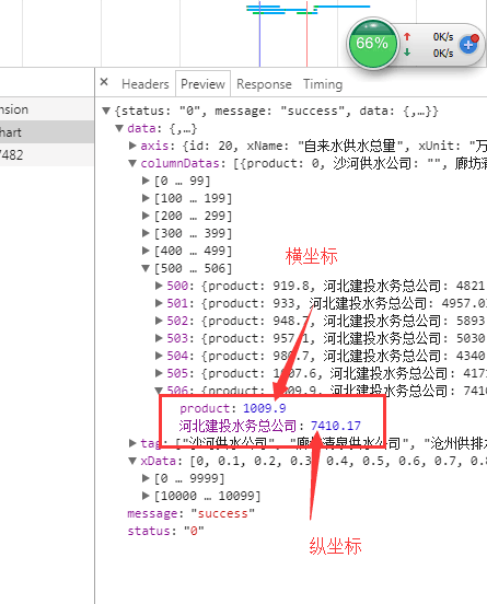
,真实数据大约是一个横坐标下面只有一个纵坐标与之对应,横坐标数组是这样的
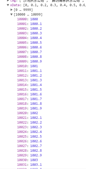
,这个数据量一大,就不能正常显示了
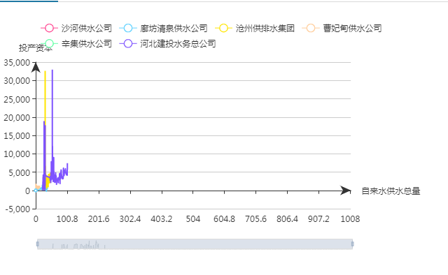,有数据的点都已经渲染在图上了,但是没有对应上它的横坐标,如果数据量少,之前是能够成功的
### Version & Environment [版本及环境]
+ ECharts version [ECharts 版本]:
+ Browser version [浏览器类型和版本]:
+ OS Version [操作系统类型和版本]:
### Expected behaviour [期望结果]
### ECharts option [ECharts配置项]
<!-- Copy and paste your 'echarts option' here. -->
<!-- [下方贴你的option,注意不要删掉下方 ```javascript 和 尾部的 ``` 字样。最好是我们能够直接运行的 option。如何得到能运行的 option 参见上方的 guidelines for contributing] -->
```javascript
setOption=()=>{
const {company,prodChartData} = this.props.productFunc;
//得到series
const getSeries =()=>{
let arr = [];
company.map((item)=>{
arr.push({type: 'line', connectNulls: true,smooth: true});
})
return arr;
}
const option = {
legend: {
// data:company,
// show:false,
selected:this.state.selectedChart
},
grid: {
left: '1%',
right: '17%',
containLabel: true
},
tooltip: {
trigger:'axis',
},
dataset: {
// dimension:dimension,
// 提供一份数据。
source: prodChartData.columnDatas
},
color:colorArr,
// 声明一个 X 轴,类目轴(category)。默认情况下,类目轴对应到 dataset 第一列。
xAxis: {
name:prodChartData.axis.xName,
type: 'category',
axisTick:{
alignWithLabel:true,
},
axisLine:{
symbol:['none','arrow']
},
data:prodChartData.xData
},
// 声明一个 Y 轴,数值轴。
yAxis: {
name:prodChartData.axis.yName,
axisLine:{
symbol:['none','arrow']
},
},
dataZoom:{
type:'slider',
height:'15px'
},
// 声明多个 line 系列,默认情况下,每个系列会自动对应到 dataset 的每一列。
series: getSeries()
}
return option;
}
```
### Other comments [其他信息]
<!-- For example: Screenshot or Online demo -->
<!-- [例如,截图或线上实例 (JSFiddle/JSBin/Codepen)] -->
----------------------------------------------------------------
This is an automated message from the Apache Git Service.
To respond to the message, please log on GitHub and use the
URL above to go to the specific comment.
For queries about this service, please contact Infrastructure at:
users@infra.apache.org
With regards,
Apache Git Services
---------------------------------------------------------------------
To unsubscribe, e-mail: dev-unsubscribe@echarts.apache.org
For additional commands, e-mail: dev-help@echarts.apache.org