You are viewing a plain text version of this content. The canonical link for it is here.
Posted to commits@echarts.apache.org by GitBox <gi...@apache.org> on 2019/10/24 06:41:19 UTC
[GitHub] [incubator-echarts] yimelia opened a new issue #11476: dark主题下的axisPointer label背景颜色过淡导致无法看清
yimelia opened a new issue #11476: dark主题下的axisPointer label背景颜色过淡导致无法看清
URL: https://github.com/apache/incubator-echarts/issues/11476
### Version
4.3.0
### Reproduction link
[https://echarts.apache.org/examples/zh/editor.html?c=multiple-y-axis&theme=dark](https://echarts.apache.org/examples/zh/editor.html?c=multiple-y-axis&theme=dark)
### Steps to reproduce
设置了
axisPointer: {
type: 'cross'
}
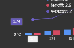
之后,在生成图标时选择dark theme,会发现十字型的坐标轴指示器背景颜色与axisLine.lineStyle:中设定的颜色一致,在dark主题下默认是灰白色,几乎看不清文字信息。
请参考链接中的X轴的效果。
### What is expected?
最好是能够独立设置坐标轴指示器的文字颜色
### What is actually happening?
在dark主题下默认是灰白色,几乎看不清文字信息。
<!-- This issue is generated by echarts-issue-helper. DO NOT REMOVE -->
----------------------------------------------------------------
This is an automated message from the Apache Git Service.
To respond to the message, please log on to GitHub and use the
URL above to go to the specific comment.
For queries about this service, please contact Infrastructure at:
users@infra.apache.org
With regards,
Apache Git Services
---------------------------------------------------------------------
To unsubscribe, e-mail: commits-unsubscribe@echarts.apache.org
For additional commands, e-mail: commits-help@echarts.apache.org