You are viewing a plain text version of this content. The canonical link for it is here.
Posted to commits@weex.apache.org by ha...@apache.org on 2018/01/18 04:30:53 UTC
[1/2] incubator-weex-site git commit: update docs for
extend-web-render, switch, dom.
Repository: incubator-weex-site
Updated Branches:
refs/heads/master e161178dd -> 9d520f905
update docs for extend-web-render, switch, dom.
Project: http://git-wip-us.apache.org/repos/asf/incubator-weex-site/repo
Commit: http://git-wip-us.apache.org/repos/asf/incubator-weex-site/commit/910fbcbd
Tree: http://git-wip-us.apache.org/repos/asf/incubator-weex-site/tree/910fbcbd
Diff: http://git-wip-us.apache.org/repos/asf/incubator-weex-site/diff/910fbcbd
Branch: refs/heads/master
Commit: 910fbcbd7d7d214d5c59e7aa2799e995b67b4831
Parents: f4ff460
Author: MrRaindrop <te...@gmail.com>
Authored: Thu Jan 18 12:23:08 2018 +0800
Committer: MrRaindrop <te...@gmail.com>
Committed: Thu Jan 18 12:23:08 2018 +0800
----------------------------------------------------------------------
source/cn/guide/extend-web-render.md | 35 ++--
source/cn/references/components/switch.md | 145 ++++++--------
source/cn/references/modules/dom.md | 253 +++---------------------
source/guide/extend-web-render.md | 37 ++--
source/references/components/switch.md | 141 ++++++--------
source/references/modules/dom.md | 256 ++++---------------------
6 files changed, 213 insertions(+), 654 deletions(-)
----------------------------------------------------------------------
http://git-wip-us.apache.org/repos/asf/incubator-weex-site/blob/910fbcbd/source/cn/guide/extend-web-render.md
----------------------------------------------------------------------
diff --git a/source/cn/guide/extend-web-render.md b/source/cn/guide/extend-web-render.md
index afbca7f..05dee3b 100644
--- a/source/cn/guide/extend-web-render.md
+++ b/source/cn/guide/extend-web-render.md
@@ -6,23 +6,24 @@ order: 6.1
version: 2.1
---
-# 如何扩展 Weex Web 端的组件和模块
+# 横向扩展 weex 组件
+
+Vue.js 本身就是一个独立的前端框架,在浏览器中完全能够不基于 Weex 容器渲染。因此,针对 Weex 平台扩展 Vue.js 的 Web 端组件,和直接使用 Vue.js 开发一个 Web 组件是一样的。具体的组件编写方法可以参考其官方文档:[组件](https://cn.vuejs.org/v2/guide/components.html) ,另外建议使用 `.vue` 格式的文件编写组件,使用方法参考:[单文件组件](https://cn.vuejs.org/v2/guide/single-file-components.html)。
+
+# 扩展 Web 端 renderer 的内置组件
Weex 本身提供了很多内置组件和模块,也具备横向扩展的能力,允许开发者自行扩展和定制。需要注意的是,Weex 是一个跨平台的解决方案,扩展其内置组件或模块,需要在三端(Android、iOS、Web)中都有相应的实现。
Weex 将内核切换成 Vue 2.x 之后,在 Web 端扩展 Vue 组件将变得更加容易。
-## 扩展 Web 组件
+目前我们提供了 [weex-vue-render](https://github.com/weexteam/weex-vue-render) 作为 Vue 2.x Web 端的渲染器。首先引入该库到你的项目里,然后牛就可以使用 `weex.registerComponent` 来进行内置组件扩展了,也可以使用 `Vue.component`,两者基本上是一致的。
-Vue.js 本身就是一个独立的前端框架,在浏览器中完全能够不基于 Weex 容器渲染。因此,针对 Weex 平台扩展 Vue.js 的 Web 端组件,和直接使用 Vue.js 开发一个 Web 组件是一样的。具体的组件编写方法可以参考其官方文档:[组件](https://cn.vuejs.org/v2/guide/components.html) ,另外建议使用 `.vue` 格式的文件编写组件,使用方法参考:[单文件组件](https://cn.vuejs.org/v2/guide/single-file-components.html)。
-
-### 扩展组件示例
+## 扩展内置组件示例
以扩展 `<sidebar>` 为例,首先应该编写组件自身的逻辑:
```html
<!-- sidebar.vue -->
-
<template>
<div class="sidebar">
<slot></slot>
@@ -49,9 +50,12 @@ Vue.js 本身就是一个独立的前端框架,在浏览器中完全能够不
```js
import Vue from 'vue'
+import weex from 'weex-vue-render'
import Sidebar from './path/to/sidebar.vue'
-
+weex.init(Vue)
// 全局注册 sidebar 组件
+weex.registerComponent('sidebar', Sidebar)
+// 或者使用 Vue.component
Vue.component('sidebar', Sidebar)
```
@@ -59,21 +63,22 @@ Vue.component('sidebar', Sidebar)
如果你定制组件时不得不用到目前 Weex 不支持的标签和样式,在这种情况下才是真正的“扩展”了 Weex 的组件,你还需要在 Android 和 iOS 中有相应的实现,不然会导致渲染异常。
-## 扩展 Web 模块
+# 扩展 Web 模块
除了通用组件以外,Weex 还有提供了通用的模块,可以方便的调用原生 API。通常来说,注册 Weex 模块要求三端都得有相应的实现,否则会影响其正常的使用。
-### 注册模块
+## 注册模块
如果你引入了 `weex-vue-render` 这个库,那么在全局能获取到 `weex` 这个变量,其中提供了 `registerModule` 方法可以注册模块。
-#### API 格式
+## API 格式
+ `registerModule`
- 0. `name`: {String} 必选,模块名称。
- 0. `define`: {Object} 必选,模块的定义。
+ 1. `name`: {String} 必选,模块名称。
+ 2. `define`: {Object} 必选,模块的定义。
+ 3. `meta`: {Object} 可选,如果你需要将非 iterable 的属性或方法注册到模块对象里,你才需要用到这个参数,将 `{ registerType: 'assignment' }` 作为 meta 参数传入即可。
-#### 注册模块示例
+## 注册模块示例
下边的代码注册了一个名为 `guide` 的模块:
@@ -88,7 +93,7 @@ weex.registerModule('guide', {
})
```
-### 使用模块
+## 使用模块
在 `weex` 上提供了 `require` 方法用于获取已注册的模块,直接传递模块名即可:
@@ -101,4 +106,4 @@ guide.greeting()
guide.farewell()
```
-上述写法在 Native 环境中依然有效,只不过模块中的方法是由 Native 提供的。
+上述模块使用方法在 Native 环境中依然有效,只不过模块中的方法是由 Native 提供的。
http://git-wip-us.apache.org/repos/asf/incubator-weex-site/blob/910fbcbd/source/cn/references/components/switch.md
----------------------------------------------------------------------
diff --git a/source/cn/references/components/switch.md b/source/cn/references/components/switch.md
index 0863a81..fb87364 100644
--- a/source/cn/references/components/switch.md
+++ b/source/cn/references/components/switch.md
@@ -6,45 +6,47 @@ order: 8.12
version: 2.1
---
-# <switch>
-
<span class="weex-version">v0.6.1+</span>
-`<switch>` 是 Weex 的内置组件,用来创建与 iOS 一致样式的按钮。例如,在 iPhone 中的设置应用中的飞行模式按钮就是一个 switch 按钮。
-## 子组件
+`<switch>` 是个类似 checkbox 的 UI
+
+> **注意:** switch 组件的外观在三个平台(iOS, Android, Web)稍有不同,这和各平台的 UI 风格有关。
+
+| Android | Web | iOS |
+| -------- | --- | --- |
+| 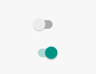 | 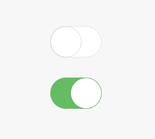 | 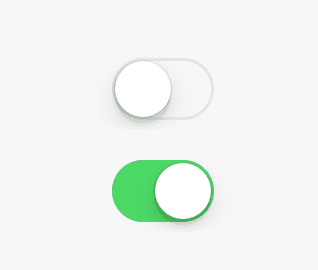 |
-`<switch>` 组件**不支持**任何子组件。
+> **注意:** switch 不支持一些涉及布局的样式, 如 `width`, `height`, `margin` 等,下面有详细的样式不支持列表.
+
+## 基本用法
+
+```html
+<switch></switch>
+```
+
+参考[示例](http://dotwe.org/vue/00f4b68b3a86360df1f38728fd0b4a1f).
## 特性
-- `checked {boolean}`:默认值为 `false`,表明按钮是否开启 is on or not.
-- `disabled {boolean}`:默认值为 `false`,表明是否激活按钮
+| Attribute | Type | Value | Default Value |
+| ------------- | ------ | -------------------------- | ------------- |
+| `checked` | Boolean | true / false | false |
+| `disabled` | Boolean | true / false | false |
-## 样式
-值得注意的是,在这个组件上,有些样式组件属性**不能使用**,它们是:
+### `checked`
-- `width`
-- `height`
-- `min-width`
-- `min-height`
-- `margin`
-- `padding`
-- `border`
+表示组件的选中状态。
-**注意:**
+### `disabled`
-如果 `<switch>` 的容器没有设置为 `align-items:flex-start`,则 Android 中的开关将被拉伸。
+表示组件是否处于不可交互状态。
-- 通用样式
- - `flexbox` 布局
- - `position`
- - `opacity`
- - `background-color`
+## 组件方法
- 查看 [组件通用样式](../common-style.html)
+无。
## 事件
@@ -66,69 +68,36 @@ version: 2.1
查看 [通用事件](../common-event.html)
-## 示例
+## 样式
-```html
-<template>
- <div>
- <div class="example">
- <text class="label">normal</text>
- <switch></switch>
- </div>
- <div class="example">
- <text class="label">checked</text>
- <switch checked="true"></switch>
- </div>
- <div class="example">
- <text class="label">disabled</text>
- <switch disabled="true" checked="true"></switch>
- <switch disabled="true"></switch>
- </div>
- <div class="example">
- <text class="label">onchange</text>
- <switch @change="onchange"></switch>
- <text class="info">{{checked}}</text>
- </div>
- </div>
-</template>
-
-<script>
- export default {
- data () {
- return {
- checked: false
- }
- },
- methods: {
- onchange (event) {
- console.log(`onchage, value: ${event.value}`)
- this.checked = event.value
- }
- }
- }
-</script>
-
-<style scoped>
- .example {
- flex-direction: row;
- justify-content: flex-start;
- margin-top: 60px;
- }
- .label {
- font-size: 40px;
- line-height: 60px;
- width: 350px;
- color: #666;
- text-align: right;
- margin-right: 20px;
- }
- .info {
- font-size: 30px;
- line-height: 60px;
- color: #BBB;
- margin-left: 10px;
- }
-</style>
-```
+> **注意:** 某些样式在 switch 组件上不能使用或使用无效,它们是:
+
+- `width`
+- `height`
+- `min-width`
+- `min-height`
+- `margin` 和 `margin-xxx`
+- `padding` 和 `padding-xxx`
+- `border` 和 `border-xxx`
+
+> **注意:** 如果 `<switch>` 的容器没有设置为 `align-items:flex-start`,则 Android 中的开关将被拉伸。
+
+- 通用样式
+
+ - `flexbox` 布局
+ - `position`
+ - `opacity`
+ - `background-color`
+
+查看 [组件通用样式](../common-style.html)
+
+
+## 使用说明
+
+- 不要设置样式 `width` and `height`,因为它们用在 `<switch>` 上不会影响该组件的外观和布局.
+- `<switch>` 不支持内嵌子组件.
+
+## 示例
-[try it](http://dotwe.org/vue/06b1d740fb69d04f9ebe9eaf730974d1)
+- [简单示例](http://dotwe.org/vue/00f4b68b3a86360df1f38728fd0b4a1f)
+- [各种状态的 switch](http://dotwe.org/vue/9068f28ba80e871d89dabb9fccff5cc6)
http://git-wip-us.apache.org/repos/asf/incubator-weex-site/blob/910fbcbd/source/cn/references/modules/dom.md
----------------------------------------------------------------------
diff --git a/source/cn/references/modules/dom.md b/source/cn/references/modules/dom.md
index e3e6ba1..712dccf 100644
--- a/source/cn/references/modules/dom.md
+++ b/source/cn/references/modules/dom.md
@@ -8,127 +8,38 @@ version: 2.1
# dom
-包含如下可以更新 dom 树的 dom API。
+`dom` 模块用于对 weex 页面里的组件节点进行一部分特定操作。
-这部分API是通过把 virtual-dom 的消息发送到 native 渲染器来做到的。
+你可以使用该模块来获取某个组件的 bounding rect 布局信息,或者将 list 的某个子节点滚动到当前视口,或者添加一个 font-face rule,等等。
-开发者在日常开发中,唯一可在 `.vue` 文件中使用的是 `scrollToElement`。
-~~你也可以调用 `$scrollTo` 方法来使用它~~
-
-这个页面提及的其他的 API,只在 `callNative` 进程中的 native 渲染器用。
-(关于 `callNative` 进程的进一步介绍,可以在 [How it works](../../advanced/how-it-works.html)中的 JS Framework 部分看到 )
+> **Note:** API `addRule` 目前仅支持添加 'font-face'.
## API
-### scrollToElement(node, options)
-让页面滚动到那个对应的节点,这个API只能在 `<scroller>` 和 `<list>` 组件中用。
+### scrollToElement(ref, options)
-~~这个API也能通过调用VM的方法 `$scrollTo` 来使用(已弃用)~~
+让页面滚动到 ref 对应的组件,这个 API 只能用于可滚动组件的子节点,例如 `<scroller>`,`<list>` 等可滚动组件中。
-要在你的 `.vue` 文件中使用这个 API,可以使用 `weex.requireModule('dom').scrollToElement`。
+> 要在你的 `.vue` 文件中使用这个 API,可以使用 `weex.requireModule('dom').scrollToElement`。
#### 参数
-- `node {Node}`:你要滚动到的那个节点
-- `options {Object}`:如下选项
-- `offset {number}`:一个到其可见位置的偏移距离,默认是 `0`
+
+- `ref {Node}`:你要滚动到的那个节点
+- `options {Object}`:
+- `offset {number}`: 一个到其可见位置的偏移距离,默认是 `0`
- `animated {boolean}` <sup class="wx-v">0.10+</sup>:是否需要附带滚动动画,默认是`true`
#### 示例
-```html
-<template>
- <div class="wrapper">
- <scroller class="scroller">
- <div class="row" v-for="(name, index) in rows" :ref="'item'+index">
- <text class="text" :ref="'text'+index">{{name}}</text>
- </div>
- </scroller>
- <div class="group">
- <text @click="goto10" class="button">Go to 10</text>
- <text @click="goto20" class="button">Go to 20</text>
- </div>
- </div>
-</template>
-
-<script>
- const dom = weex.requireModule('dom')
-
- export default {
- data () {
- return {
- rows: []
- }
- },
- created () {
- for (let i = 0; i < 30; i++) {
- this.rows.push('row ' + i)
- }
- },
- methods: {
- goto10 (count) {
- const el = this.$refs.item10[0]
- dom.scrollToElement(el, {})
- },
- goto20 (count) {
- const el = this.$refs.item20[0]
- dom.scrollToElement(el, { offset: 0 })
- }
- }
- }
-</script>
-
-<style scoped>
- .scroller {
- width: 700px;
- height: 700px;
- border-width: 3px;
- border-style: solid;
- border-color: rgb(162, 217, 192);
- margin-left: 25px;
- }
- .row {
- height: 100px;
- flex-direction: column;
- justify-content: center;
- padding-left: 30px;
- border-bottom-width: 2px;
- border-bottom-style: solid;
- border-bottom-color: #DDDDDD;
- }
- .text {
- font-size: 45px;
- color: #666666;
- }
- .group {
- flex-direction: row;
- /*justify-content: space-around;*/
- justify-content: center;
- margin-top: 60px;
- }
- .button {
- width: 200px;
- padding-top: 20px;
- padding-bottom: 20px;
- font-size: 40px;
- margin-left: 30px;
- margin-right: 30px;
- text-align: center;
- color: #41B883;
- border-width: 2px;
- border-style: solid;
- border-color: rgb(162, 217, 192);
- background-color: rgba(162, 217, 192, 0.2);
- }
-</style>
-```
-
-[try it](http://dotwe.org/vue/56e0d256cbb26facd958dbd6424f42b2)
+[滚动到某层](http://dotwe.org/vue/56e0d256cbb26facd958dbd6424f42b2)
### getComponentRect(ref, callback) <span class="api-version">v0.9.4+</span>
+`支持版本: >=0.9.4`
+
通过标签的 `ref` 获得其布局信息,返回的信息在 `callBack` 中,格式参考如下:
-```json
+```javascript
{
result: true,
size: {
@@ -142,141 +53,29 @@ version: 2.1
}
```
-如果想要获取到 Weex 容器的布局信息,可以指定 `ref='viewport'`,调用例子如下:
-
-```html
-<template>
- <div class="wrapper" style='margin-top:200px'>
- <div ref="box" class="box">
- <text class="info">Width: {{size.width}}</text>
- <text class="info">Height: {{size.height}}</text>
- <text class="info">Top: {{size.top}}</text>
- <text class="info">Bottom: {{size.bottom}}</text>
- <text class="info">Left: {{size.left}}</text>
- <text class="info">Right: {{size.right}}</text>
- </div>
-
- <text class="info btn" @click='click()'>{{this.tip}}</text>
-
- </div>
-</template>
-
-<script>
- const dom = weex.requireModule('dom')
+如果想要获取到 Weex 视口容器的布局信息,可以指定 `ref` 为字符串 `'viewport'`,即 `getComponentRect('viewport', callback)`.
- function round(size) {
- var roundSize = {
- 'width': Math.round(size.width),
- 'height': Math.round(size.height),
- 'top': Math.round(size.top),
- 'bottom': Math.round(size.bottom),
- 'left': Math.round(size.left),
- 'right': Math.round(size.right)
- }
- return roundSize
- }
-
- export default {
- data () {
- return {
- size: {
- width: 0,
- height: 0,
- top: 0,
- bottom: 0,
- left: 0,
- right: 0
- },
- ref:"viewport",
- tip:"get box rect"
- }
- },
- mounted () {
- const result = dom.getComponentRect(this.ref, option => {
- console.log('getComponentRect:', option)
- this.size = round.call(this,option.size);
- })
- },
-
- methods:{
- click:function() {
- if (this.ref === 'viewport') {
- this.ref = this.$refs.box;
- this.tip = "get viewport rect"
- } else {
- this.ref = 'viewport'
- this.tip = "get box rect"
- }
-
- const result = dom.getComponentRect(this.ref, option => {
- console.log('getComponentRect:', option)
- this.size = round.call(this,option.size);
- })
- }
- }
-
- }
-</script>
-
-<style scoped>
- .btn {
- margin-top:20px;
- border-width:2px;
- border-style: solid;
- border-radius:10px;
- width:300px;
- margin-left:170px;
- padding-left:35px;
- border-color: rgb(162, 217, 192);
-
- }
- .btn:active {
- background-color: #8fbc8f;
- border-color: gray;
- }
+#### 示例
- .box {
- align-items:center;
- margin-left: 150px;
- width: 350px;
- height: 400px;
- background-color: #DDD;
- border-width: 2px;
- border-style: solid;
- border-color: rgb(162, 217, 192);
- background-color: rgba(162, 217, 192, 0.2);
- }
- .info {
- font-size: 40px;
- top:30px;
- margin-left:20px;
- font-family: Consolas, "Liberation Mono", Menlo, Courier, monospace;
- color: #41B883;
- }
-</style>
-```
+
-[try it](http://dotwe.org/vue/d069a9bf0f0781b914f12a9a7b9a1447)
+### addRule(type, contentObject) <span class="api-version">v0.12.0+</span>
-### addRule
-`支持版本:v0.12.0`
+`支持版本: >=0.12.0`
addRule是可以为dom 添加一条规则,目前支持自定义字体fontFace规则,构建自定义的font-family,可以在[text](../components/text.html#iconfont)使用
#### fontFace
-```html
-var domModule = weex.requireModule('dom');
+```javascript
+const domModule = weex.requireModule('dom')
domModule.addRule('fontFace', {
- 'fontFamily': "iconfont2",
- 'src': "url('http://at.alicdn.com/t/font_1469606063_76593.ttf')"
-});
-
+ 'fontFamily': "iconfont2",
+ 'src': "url('http://at.alicdn.com/t/font_1469606063_76593.ttf')"
+})
```
-[try it](http://dotwe.org/vue/95b2c6716f37066d5f44c5c75c979394)
-
-## 其他
+#### 示例
-dom 还有一些底层接口用于创建 Weex 实例时调用,比如 `createBody`、`updateAttrs` 等,但并未开放供外部使用。
+[add rule fontface](http://dotwe.org/vue/95b2c6716f37066d5f44c5c75c979394)
http://git-wip-us.apache.org/repos/asf/incubator-weex-site/blob/910fbcbd/source/guide/extend-web-render.md
----------------------------------------------------------------------
diff --git a/source/guide/extend-web-render.md b/source/guide/extend-web-render.md
index b21ea45..8eb5871 100644
--- a/source/guide/extend-web-render.md
+++ b/source/guide/extend-web-render.md
@@ -1,22 +1,25 @@
---
-title: Extend Web Render
+title: Extend Web Renderer
type: guide
group: Extend
order: 6.2
version: 2.1
---
-# Extend to HTML5
+# Extend Web components
+
+Vue.js is an independent front-end framework. In the browser, you can not use the Weex container for page rendering. So, the two things are the same: (1) for the Weex platform to expand Vue.js Web components. (2) directly using Vue.js to develop a Web component. The development of components can refer to its documentation: [component](https://vuejs.org/v2/guide/components.html). It is also recommended to use the ```.vue``` file to write components. How to use it: [Single file component](https://vuejs.org/v2/guide/single-file-components.html).
+
+# Extend Web renderer's built-in components
Weex itself offers a lot of built-in components and modules, but also has the ability to expand horizontally. It allows developers to expand and customize themselves. But it is important to note that Weex is a cross-platform solution. When extending its built-in components or modules, you need to implement it on the three ends (Android, iOS, Web).
After Weex switches the kernel to Vue 2.x, it will be easier to extend the Vue component on the Web side.
-## Extend Web components
+We current use [weex-vue-render](https://github.com/weexteam/weex-vue-render) for Vue 2.x Web side rendering. Firstly import this library in your web page, then you can extend the render's built-in components using `weex.registerComponent` or `Vue.component`. Basically these two methods are doing the same thing.
-Vue.js is an independent front-end framework. In the browser, you can not use the Weex container for page rendering. So, the two things are the same: (1) for the Weex platform to expand Vue.js Web components. (2) directly using Vue.js to develop a Web component. The development of components can refer to its documentation: [component](https://vuejs.org/v2/guide/components.html). It is also recommended to use the ```.vue``` file to write components. How to use it: [Single file component](https://vuejs.org/v2/guide/single-file-components.html).
+## Example of extension for weex built-in components.
-### Example of component extension
To extend ```<sidebar>``` as an example, you should first write the logic of the component itself:
```html
@@ -45,29 +48,37 @@ And then register the ```<sidebar>``` component globally before using it:
```javascript
import Vue from 'vue'
+import weex from 'weex-vue-render'
import Sidebar from './path/to/sidebar.vue'
+weex.init(Vue)
// register the ```<sidebar>``` component globally
-Vue.component('sidebar', Sidebar)
+weex.registerComponent('sidebar', Sidebar)
+// or:
+// Vue.component('sidebar', Sidebar)
```
When you extend the Weex component, if you only use the built-in components provided by Weex and use the styles that Weex supports, it is no different from the normal custom component and does not need to be implemented at the Native side.
If you find a component that does not support labels and styles that are not supported by Weex, you will need to really extend the Weex component. At the same time, you also need to extend in the Android side and the iOS side, or will lead to rendering exception.
-## Extend the Web module
+# Extend the Web module
In addition to the common components, Weex also provides a common module, you can easily call the native API. In general, the registered Weex module requires three ends to be implemented, otherwise it will affect its normal use.
-### Register the module
+## Register the module
+
If we import the ```weex-vue-render``` library, we can get the weex variable globally. You can register the module using the ```registerModule```method.
-#### API format
+## API format
+
+ `registerModule`
- 1.```name```: {String} Required, module name.
- 2.```define```: {Object} Required, module definition.
+ 1. ```name```: {String} Required, module name.
+ 2. ```define```: {Object} Required, module definition.
+ 3. `meta`: {Object} Optional, module meta info. Basically you won't need this except you want to pass a non iterable attribute or method from your module implementation object. In this case you should pass a `{ registerType: 'assignment' }` object to it. Otherwise only the iterables will be registered in the module.
+
+## The example of register module
-#### The example of register module
The following code registers a module called guide:
```javascript
@@ -81,7 +92,7 @@ weex.registerModule('guide', {
})
```
-### Use the module
+## Use the module
Weex provides the require method for getting registered modules. You only need to pass the module name directly:
http://git-wip-us.apache.org/repos/asf/incubator-weex-site/blob/910fbcbd/source/references/components/switch.md
----------------------------------------------------------------------
diff --git a/source/references/components/switch.md b/source/references/components/switch.md
index be44c25..30bd0e9 100644
--- a/source/references/components/switch.md
+++ b/source/references/components/switch.md
@@ -6,111 +6,78 @@ order: 8.12
version: 2.1
---
-# <switch>
-
<span class="weex-version">v0.6.1+</span>
-The weex builtin component switch is used to create and manage an IOS styled On/Off buttons, for example, the Airplane mode button in the Settings app is a switch button.
+`<switch>` is a checkbox-like UI component.
+
+> **Note:** The appearance of switch component is a bit of different in three ends (iOS, Android, Web) in consideration of different platform styles.
+
+| Android | Web | iOS |
+| -------- | --- | --- |
+|  |  |  |
+> **Note:** Layout style attributes listed below such as `width`, `height`, `margin` are not supported.
-## Child Components
+## Basic Usage
+
+```html
+<switch></switch>
+```
-There are no child components for the switch component.
+See the [example](http://dotwe.org/vue/00f4b68b3a86360df1f38728fd0b4a1f).
## Attributes
-* checked <boolean> true|false, default value is false, indicating whether the button is on or not.
-* disabled <boolean> true|false, default value is false, indicating whether the button is enable or not.
+| Attribute | Type | Value | Default Value |
+| ------------- | ------ | -------------------------- | ------------- |
+| `checked` | Boolean | true / false | false |
+| `disabled` | Boolean | true / false | false |
-## Styles
-Notes: There are several style properties that you mustn't use on this component. And here are all the invalid properties:
+### `checked`
-* width
-* height
-* min-width
-* min-height
-* margin and margin-xxs
-* padding and padding-xxs
-* border and border-xxs
+Indicates this component's status is set to true or false.
-Notes: If the container of `<switch>` is not set to `align-items:flex-start`, the switch in android will be stretched.
+### `disabled`
-common styles: check out [common styles for components](../common-style.html)
+Indicates this component is not available for interaction.
+
+## Component Methods
+
+None.
## Events
-* onappear / ondisappear event. check out [common events](../common-event.html)
-* onclick: check out [common events](../common-event.html)
-* onchange: check out [common events](../common-event.html)
+* `appear` / `disappear` event. check out [common events](../common-event.html)
+* `click` / `longpress`: check out [common events](../common-event.html)
+* `change`: check out [common events](../common-event.html)
## Parameters of events' object for onchange event:
-* value: the value of the component who dispatched this event, which is the boolean value true or false.
-* timestamp: the time stamp of the event.
+* `value`: the value of the component who dispatched this event, which is the boolean value true or false.
+* `timestamp`: the time stamp of the event.
-## Examples
+## Styles
-```html
-<template>
- <div>
- <div class="example">
- <text class="label">normal</text>
- <switch></switch>
- </div>
- <div class="example">
- <text class="label">checked</text>
- <switch checked="true"></switch>
- </div>
- <div class="example">
- <text class="label">disabled</text>
- <switch disabled="true" checked="true"></switch>
- <switch disabled="true"></switch>
- </div>
- <div class="example">
- <text class="label">onchange</text>
- <switch @change="onchange"></switch>
- <text class="info">{{checked}}</text>
- </div>
- </div>
-</template>
-
-<script>
- export default {
- data () {
- return {
- checked: false
- }
- },
- methods: {
- onchange (event) {
- console.log(`onchage, value: ${event.value}`)
- this.checked = event.value
- }
- }
- }
-</script>
-
-<style scoped>
- .example {
- flex-direction: row;
- justify-content: flex-start;
- margin-top: 60px;
- }
- .label {
- font-size: 40px;
- line-height: 60px;
- width: 350px;
- color: #666;
- text-align: right;
- margin-right: 20px;
- }
- .info {
- font-size: 30px;
- line-height: 60px;
- color: #BBB;
- margin-left: 10px;
- }
-</style>
-```
+> **Notes:** There are several style properties that you mustn't use on this component. And here are all the invalid properties:
+
+* `width`
+* `height`
+* `min-width`
+* `min-height`
+* `margin` and `margin-xxx`
+* `padding` and `padding-xxx`
+* `border` and `border-xxx`
+
+> **Notes:** If the container of `<switch>` is not set to `align-items:flex-start`, the switch in android will be stretched.
+
+common styles: check out [common styles for components](../common-style.html)
+
+## Usage Notes
+
+- The `width` and `height` in the styles of `<switch>` won't effect the component's apparence and layout.
+- `<switch>` can not have any nested child component.
+
+## Examples
-[try it](http://dotwe.org/vue/06b1d740fb69d04f9ebe9eaf730974d1)
+- [Simple Switch](http://dotwe.org/vue/00f4b68b3a86360df1f38728fd0b4a1f)
+- [Switch List](http://dotwe.org/vue/9068f28ba80e871d89dabb9fccff5cc6)
http://git-wip-us.apache.org/repos/asf/incubator-weex-site/blob/910fbcbd/source/references/modules/dom.md
----------------------------------------------------------------------
diff --git a/source/references/modules/dom.md b/source/references/modules/dom.md
index 0298b53..ad0408f 100644
--- a/source/references/modules/dom.md
+++ b/source/references/modules/dom.md
@@ -6,125 +6,44 @@ order: 9.01
version: 2.1
---
-# dom
+# Dom
-## Summary
+## Overview
-A series of dom apis that sending virtual-dom's messages to the native renderer to update the dom tree. The only API for developers to use in a `.vue` file is `scrollToElement` <del>which you can use by calling the `$scrollTo` method</del>. Other APIs mentioned on this page should only be used through the native renderer in the `callNative` process.
+The `dom` module is used to manipulate the components in weex pages.
+
+You can use these APIs to get a component's bounding rect in the page, or scroll a list to some specific component, or add a font-face rule to the page and so on.
+
+> **Note:** The `addRule` method is currently used only with font-face supportability.
## API
-### scrollToElement(node, options)
+### scrollToElement(ref, options)
-Scroll the page to the specified node. This API should only be used on the element in the `scroller` or `list` component.
+Scroll the scrollable component to the referenced component. This API should only be used in the children components of a scrollable component, such as in a `<scroller>` or `<list>` component.
-<del>This API can be used by calling the VM's method `$scrollTo` **(deprecated)**.</del> You can use `weex.requireModule('dom').scrollToElement` to call this API in your `.we` file.
+> **NOTE:** You can use `weex.requireModule('dom')` to requrie the dom module, and use `weex.requireModule('dom').scrollToElement` to call this API.
#### Arguments
-* `node`*(Node)*: an element that scrolled into the view.
-* `options`*(object)*: some options.
- * `offset`*(number)*: An offset to the visible position, default is `0`.
- * `animated` *(bool)* :set element animation, default true
+* `ref`*(Node)*: the referenced component who is meant to scroll into the view.
+* `options`*(object)*:
+ * `offset`*(number)*: An space on top of the ref component, which is also scrolling down to the visual viewport. Default is `0`.
+ * `animated` *(bool)*: <sup class="wx-v">0.10+</sup> Indicates whether a scroll animation should be played. If set to false, the ref component will jump into the view without any transition animation. Default is true.
#### Example
-```html
-<template>
- <div class="wrapper">
- <scroller class="scroller">
- <div class="row" v-for="(name, index) in rows" :ref="'item'+index">
- <text class="text" :ref="'text'+index">{{name}}</text>
- </div>
- </scroller>
- <div class="group">
- <text @click="goto10" class="button">Go to 10</text>
- <text @click="goto20" class="button">Go to 20</text>
- </div>
- </div>
-</template>
+[Scroll To Floor](http://dotwe.org/vue/56e0d256cbb26facd958dbd6424f42b2)
-<script>
- const dom = weex.requireModule('dom')
+### getComponentRect(ref, callback) <span class="api-version">v0.9.4+</span>
- export default {
- data () {
- return {
- rows: []
- }
- },
- created () {
- for (let i = 0; i < 30; i++) {
- this.rows.push('row ' + i)
- }
- },
- methods: {
- goto10 (count) {
- const el = this.$refs.item10[0]
- dom.scrollToElement(el, {})
- },
- goto20 (count) {
- const el = this.$refs.item20[0]
- dom.scrollToElement(el, { offset: 0 })
- }
- }
- }
-</script>
+`support: >=0.9.4`
-<style scoped>
- .scroller {
- width: 700px;
- height: 700px;
- border-width: 3px;
- border-style: solid;
- border-color: rgb(162, 217, 192);
- margin-left: 25px;
- }
- .row {
- height: 100px;
- flex-direction: column;
- justify-content: center;
- padding-left: 30px;
- border-bottom-width: 2px;
- border-bottom-style: solid;
- border-bottom-color: #DDDDDD;
- }
- .text {
- font-size: 45px;
- color: #666666;
- }
- .group {
- flex-direction: row;
- /*justify-content: space-around;*/
- justify-content: center;
- margin-top: 60px;
- }
- .button {
- width: 200px;
- padding-top: 20px;
- padding-bottom: 20px;
- font-size: 40px;
- margin-left: 30px;
- margin-right: 30px;
- text-align: center;
- color: #41B883;
- border-width: 2px;
- border-style: solid;
- border-color: rgb(162, 217, 192);
- background-color: rgba(162, 217, 192, 0.2);
- }
-</style>
-```
+You can get the bounding rect of the referenced component using this API.
-[try it](http://dotwe.org/vue/56e0d256cbb26facd958dbd6424f42b2)
+An example callback result should be like:
-### getComponentRect(ref,callback) <span class="api-version">v0.9.4+</span>
-
-You can get the view rectangle information of named element.
-
-An example callback result maybe:
-
-```json
+```javascript
{
result: true,
size: {
@@ -138,140 +57,29 @@ An example callback result maybe:
}
```
-If you want to get the rectangle information of 'weex view' container, you can specify the `ref='viewport'`.
-
-Example Useage:
-
-```html
-<template>
- <div class="wrapper" style='margin-top:200px'>
- <div ref="box" class="box">
- <text class="info">Width: {{size.width}}</text>
- <text class="info">Height: {{size.height}}</text>
- <text class="info">Top: {{size.top}}</text>
- <text class="info">Bottom: {{size.bottom}}</text>
- <text class="info">Left: {{size.left}}</text>
- <text class="info">Right: {{size.right}}</text>
- </div>
-
- <text class="info btn" @click='click()'>{{this.tip}}</text>
-
- </div>
-</template>
-
-<script>
- const dom = weex.requireModule('dom')
+If you want to get the bounding rect of outside viewport of the weex container, you can specify the `ref` as a literal string `'viewport'`, like `getComponentRect('viewport', callback)`.
- function round(size) {
- var roundSize = {
- 'width': Math.round(size.width),
- 'height': Math.round(size.height),
- 'top': Math.round(size.top),
- 'bottom': Math.round(size.bottom),
- 'left': Math.round(size.left),
- 'right': Math.round(size.right)
- }
- return roundSize
- }
-
- export default {
- data () {
- return {
- size: {
- width: 0,
- height: 0,
- top: 0,
- bottom: 0,
- left: 0,
- right: 0
- },
- ref:"viewport",
- tip:"get box rect"
- }
- },
- mounted () {
- const result = dom.getComponentRect(this.ref, option => {
- console.log('getComponentRect:', option)
- this.size = round.call(this,option.size);
- })
- },
-
- methods:{
- click:function() {
- if (this.ref === 'viewport') {
- this.ref = this.$refs.box;
- this.tip = "get viewport rect"
- } else {
- this.ref = 'viewport'
- this.tip = "get box rect"
- }
-
- const result = dom.getComponentRect(this.ref, option => {
- console.log('getComponentRect:', option)
- this.size = round.call(this,option.size);
- })
- }
- }
-
- }
-</script>
-
-<style scoped>
- .btn {
- margin-top:20px;
- border-width:2px;
- border-style: solid;
- border-radius:10px;
- width:300px;
- margin-left:170px;
- padding-left:35px;
- border-color: rgb(162, 217, 192);
-
- }
- .btn:active {
- background-color: #8fbc8f;
- border-color: gray;
- }
+#### Example
- .box {
- align-items:center;
- margin-left: 150px;
- width: 350px;
- height: 400px;
- background-color: #DDD;
- border-width: 2px;
- border-style: solid;
- border-color: rgb(162, 217, 192);
- background-color: rgba(162, 217, 192, 0.2);
- }
- .info {
- font-size: 40px;
- top:30px;
- margin-left:20px;
- font-family: Consolas, "Liberation Mono", Menlo, Courier, monospace;
- color: #41B883;
- }
-</style>
-```
+
-[try it](http://dotwe.org/vue/87d4ed571de129ab28052b06a5d65fc8)
+### addRule(type, contentObject) <span class="api-version">v0.12.0+</span>
-### addRule
-`support:v0.12.0`
+`support: >=0.12.0`
-you can add your rule for dom by this, now we support `fontFace` only for building your custom `font-family`, use it on [text](../components/text.html#iconfont) directly.
+You can add certain rules for dom throught this API. Now we only support `fontFace` for building a custom `font-family`. You can use the built `font-family` in your project for [text](../components/text.html#iconfont) component directly.
#### fontFace
-```html
-var domModule = weex.requireModule('dom');
+```javascript
+const domModule = weex.requireModule('dom')
domModule.addRule('fontFace', {
- 'fontFamily': "iconfont2",
- 'src': "url('http://at.alicdn.com/t/font_1469606063_76593.ttf')"
+ 'fontFamily': "iconfont2",
+ 'src': "url('http://at.alicdn.com/t/font_1469606063_76593.ttf')"
});
-
```
-[try it](http://dotwe.org/vue/95b2c6716f37066d5f44c5c75c979394)
+#### Example
+[add rule fontface](http://dotwe.org/vue/95b2c6716f37066d5f44c5c75c979394)
[2/2] incubator-weex-site git commit: [doc] update docs for
extend-web-render, switch, dom (#34)
Posted by ha...@apache.org.
[doc] update docs for extend-web-render, switch, dom (#34)


Project: http://git-wip-us.apache.org/repos/asf/incubator-weex-site/repo
Commit: http://git-wip-us.apache.org/repos/asf/incubator-weex-site/commit/9d520f90
Tree: http://git-wip-us.apache.org/repos/asf/incubator-weex-site/tree/9d520f90
Diff: http://git-wip-us.apache.org/repos/asf/incubator-weex-site/diff/9d520f90

Branch: refs/heads/master
Commit: 9d520f905fde2fa0dde230d62c1bad6c4040017a
Parents: e161178 910fbcb
Author: Hanks <zh...@gmail.com>
Authored: Thu Jan 18 12:30:16 2018 +0800
Committer: Hanks <zh...@gmail.com>
Committed: Thu Jan 18 12:30:16 2018 +0800

----------------------------------------------------------------------
 source/cn/guide/extend-web-render.md      |  35 ++--
 source/cn/references/components/switch.md | 145 ++++++--------
 source/cn/references/modules/dom.md       | 253 +++---------------------
 source/guide/extend-web-render.md         |  37 ++--
 source/references/components/switch.md    | 141 ++++++--------
 source/references/modules/dom.md          | 256 ++++---------------------
 6 files changed, 213 insertions(+), 654 deletions(-)
----------------------------------------------------------------------


http://git-wip-us.apache.org/repos/asf/incubator-weex-site/blob/9d520f90/source/cn/references/modules/dom.md
----------------------------------------------------------------------

http://git-wip-us.apache.org/repos/asf/incubator-weex-site/blob/9d520f90/source/references/modules/dom.md
----------------------------------------------------------------------