You are viewing a plain text version of this content. The canonical link for it is here.
Posted to commits@weex.apache.org by ky...@apache.org on 2018/12/26 13:33:53 UTC
[incubator-weex-site] branch draft updated: Update common styles
(#274)
This is an automated email from the ASF dual-hosted git repository.
kyork pushed a commit to branch draft
in repository https://gitbox.apache.org/repos/asf/incubator-weex-site.git
The following commit(s) were added to refs/heads/draft by this push:
new 6c18f43 Update common styles (#274)
6c18f43 is described below
commit 6c18f4364c9df034bc26778e5e2605cace004c1d
Author: YorkShen <sh...@gmail.com>
AuthorDate: Wed Dec 26 21:33:49 2018 +0800
Update common styles (#274)
---
docs/docs/styles/common-styles.md | 712 ++++++++++++++++++++---------------
docs/zh/docs/styles/common-styles.md | 361 +++++++++---------
2 files changed, 582 insertions(+), 491 deletions(-)
diff --git a/docs/docs/styles/common-styles.md b/docs/docs/styles/common-styles.md
index 3a45a53..492bb5f 100644
--- a/docs/docs/styles/common-styles.md
+++ b/docs/docs/styles/common-styles.md
@@ -1,252 +1,302 @@
-# 通用样式
+# Common Styles
-所有 Weex 自带组件都支持以下通用样式规则。
+All of weex tags share some common style rules
-## 盒模型
-
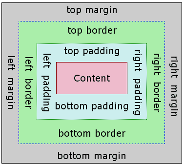
-Weex 盒模型基于 [CSS 盒模型](https://developer.mozilla.org/zh-CN/docs/Web/CSS/CSS_Box_Model/Introduction_to_the_CSS_box_model),每个 Weex 元素都可视作一个盒子。我们一般在讨论设计或布局时,会提到「盒模型」这个概念。
-
-
-
-盒模型描述了一个元素所占用的空间。每一个盒子有四条边界:外边距边界 margin edge, 边框边界 border edge, 内边距边界 padding edge 与内容边界 content edge。这四层边界,形成一层层的盒子包裹起来,这就是盒模型大体上的含义。
+::: danger
+The supported styles is listed below, and some component may support custom style, which you can check in the component's doc. Except for this, other styles are not supported.
+:::
::: warning
-- Weex 对于长度值目前只支持像素值,不支持相对单位(`em`、`rem`)。
-- **Weex 盒模型的 box-sizing 默认为 border-box,即盒子的宽高包含内容、内边距和边框的宽度,不包含外边距的宽度。**
+Weex only supports `px` as length unit, `%`, `rem`, `em` are not supported.
:::
-### 属性
-
-#### 宽度
-
-`width {length}`:默认值 0
-
-#### 高度
-
-`height {length}`:默认值 0
-
-#### 内边距
+## Box Model
+Weex box model based on the [CSS box model](https://developer.mozilla.org/zh-CN/docs/Web/CSS/CSS_Box_Model/Introduction_to_the_CSS_box_mode), all of weex elements can be considered as boxes.
-`padding {length}`:内边距,内容和边框之间的距离,默认值 0。与标准 CSS 类似,`padding` 支持简写,也可分解为以下四个:
- - `padding-left {length}`:左内边距,默认值 0
- - `padding-right {length}`:右内边距,默认值 0
- - `padding-top {length}`:上内边距,默认值 0
- - `padding-bottom {length}`:下内边距,默认值 0
-
-```css
-.content {
- /* 应用于四个边 */
- padding: 10px;
-
- /* 垂直方向| 水平方向*/
- padding: 5px 10px;
-
- /* 顶部| 水平方向| 底部*/
- padding: 1px 2px 2px;
-
- /* 顶部| 右边| 底部| 左边*/
- padding: 2px 1px 0px 1px;
-}
-```
-
-#### 外边距
+
-`margin {length}`:外边距,元素和元素之间的空白距离,默认值 0。与标准 CSS 类似,`margin` 支持简写,也可分解为以下四个:
- - `margin-left {length}`:左外边距,默认值 0
- - `margin-right {length}`:右外边距,默认值 0
- - `margin-top {length}`:上外边距,默认值 0
- - `margin-bottom {length}`:下外边距,默认值 0
+The term "box model" is used when talking about design and layout. The box model is essentially a box that wraps around every HTML element. It consists of margins, borders, paddings, and the actual content.
-```css
-.content {
- /* 应用于四个边 */
- margin: 10px;
+::: warning
+Weex only supports `box-sizing:border-box`, in which box size includes `content`, `padding` and `border-width` and excludes `margin`
+:::
- /* 垂直方向| 水平方向*/
- margin: 5px 10px;
+::: warning
+Weex only supports `overflow:hidden`.
+:::
- /* 顶部| 水平方向| 底部*/
- margin: 1px 2px 2px;
+The following code snippets shows the basic usage of box model
- /* 顶部| 右边| 底部| 左边*/
- margin: 2px 1px 0px 1px;
-}
+```html
+<template>
+ <div>
+ <image src="..." style="width: 400; height: 200; margin-left: 20;"></image>
+ </div>
+</template>
```
-#### 边框
-
-**设置元素边框暂不支持类似** `border: 1 solid #ff0000;` **的组合写法**。需分别设置 `border-width`(边框宽度),`border-style`(边框样式)和 `border-color`(边框颜色)。
-
-- `border-style {string}`:统一设定四个方向的边框样式,值类型为 `string`,**不支持简写**,可选值为:
- - `solid`:实线边框,默认值 `solid`
- - `dashed`:方形虚线边框
- - `dotted`:圆点虚线边框
-
- 如果四个方向的边框样式不同,可分别设置:
+### width
+`width`: `length` type, default value `auto`
+
+### height
+`height`: `length` type, default value `auto`
+
+### padding
+`padding` specifies the space between element content and the element border. One can use shorthand for four edges or specify the padding for one edge:
+ * `padding: {length}`: padding for four edges, default value `0`,
+ * `padding-left {length}`: default value `0`
+ * `padding-right {length}`: default value `0`
+ * `padding-top {length}`: default value `0`
+ * `padding-bottom {length}`: default value `0`
+
+### border
+#### border-style
+The `border-style` CSS property is a shorthand property that sets the line style for all four sides of an element's border. One can use shorthand for four edges or specify the style for one edge:
+ * `border-style`: values `solid` | `dashed` | `dotted`, default value `solid`
+ * `border-left-style`: values `solid` | `dashed` | `dotted`, default value `solid`
+ * `border-top-style`: values `solid` | `dashed` | `dotted`, default value `solid`
+ * `border-right-style`: values `solid` | `dashed` | `dotted`, default value `solid`
+ * `border-bottom-style`: values `solid` | `dashed` | `dotted`, default value `solid`
+
+#### border-width
+The border-width shorthand CSS property sets the widths of all four sides of an element's border. One can use shorthand for four edges or specify the width for one edge:
+ * `border-width`: `length` type, non-negative, default value `0`
+ * `border-left-width`: `length` type, non-negative, default value `0`
+ * `border-top-width`: `length` type, non-negative, default value `0`
+ * `border-right-width`: `length` type, non-negative, default value `0`
+ * `border-bottom-width`: `length` type, non-negative, default value `0`
+
+#### border-color
+The border-color shorthand CSS property sets the color of all sides of an element's border. One can use shorthand for four edges or specify the color for one edge:
+ * `border-color`: `color` type, default value `#000000`
+ * `border-left-color`: `color` type, default value `#000000`
+ * `border-top-color`: `color` type, default value `#000000`
+ * `border-right-color`: `color` type, default value `#000000`
+ * `border-bottom-color`: `color` type, default value `#000000`
+
+#### border-radius
+`border-radius` property rounds the corners of an element's outer border edge. One can use shorthand for four corners or specify the radius for one corner:
+ * `border-radius`: `length` type, default value `0` which means the corner is a right angle.
+ * `border-bottom-left-radius`: `length` type, non-negative, default value `0`
+ * `border-bottom-right-radius`: `length` type, non-negative, default value `0`
+ * `border-top-left-radius`: `length` type, non-negative, default value `0`
+ * `border-top-right-radius`: `length` type, non-negative, default value `0`
+
+::: danger
+`border-radius` defines the radius of a quarter ellipse that defines the shape of the corner of the outer border edge by definition, but weex may not render as expected if you need a smooth transition between different `border-radius` or `border-width` on adjoining sides.
+:::
- - `border-left-style {string}`:可选值为 `solid` | `dashed` | `dotted`,默认值 `solid`
- - `border-top-style {string}`:可选值为 `solid` | `dashed` | `dotted`,默认值 `solid`
- - `border-right-style {string}`:可选值为 `solid` | `dashed` | `dotted`,默认值 `solid`
- - `border-bottom-style {string}`:可选值为 `solid` | `dashed` | `dotted`,默认值 `solid`
+::: danger Only for Android
+Although `overflow:hidden` is default on android, a view **will not** clip its children according to `border-radius` unless all the following conditions meet.
+ * The view type is `div`, `a`, `cell`, `refresh` or `loading`.
+ * OS version is Android 4.3 or higher.
+ * OS version is **not** Android 7.0
+ * A view **does not** have `background-image` property nor OS version is Android 5.0 or higher.
+:::
-- `border-width {length}`:统一设定四个方向的边框宽度,非负值, 默认值 0,**不支持简写**,如果四个方向的边框宽度不同,可分别设置:
+### margin
+`margin` specifies the space around elements which is outside the border. One can use shorthand for four edges or specify the margin for one edge:
+ * `margin: {length}`: margin for four edges, default value `0`,
+ * `margin-left {length}`: margin for left edge, default value `0`
+ * `margin-right {length}`: margin for left edge, default value `0`
+ * `margin-top {length}`: margin for left edge, default value `0`
+ * `margin-bottom {length}`: margin for bottom edge, default value `0`
- - `border-left-width {length}`:非负值, 默认值 0
- - `border-top-width {length}`:非负值, 默认值 0
- - `border-right-width {length}`:非负值, 默认值 0
- - `border-bottom-width {length}`:非负值, 默认值 0
+## Flexbox
+Weex box style model based on the CSS flexbox, ensures that elements behave predictably and the page layout can accommodates to different screen sizes and different display devices.
-- `border-color {color}`:统一设定四个方向的设定边框颜色,默认值 `#000000`,**不支持简写**,如果四个方向的边框颜色不同,可分别设置:
+Flexbox consists of flex containers and flex items. If a weex element can containing other elements, it is a flex container.
- - `border-left-color {color}`:默认值 `#000000`
- - `border-top-color {color}`:默认值 `#000000`
- - `border-right-color {color}`:默认值 `#000000`
- - `border-bottom-color {color}`:默认值 `#000000`
+::: warning
+Only styles listed below is supported, other style like `order` and `flex-flow` are not supported.
+:::
-- `border-radius {length}`:统一设定四个方向的圆角,默认值 0,**不支持简写**,如果四个方向的圆角弧度不同,可分别设置:
+### Flex container
+Flexbox is the default and only style model in Weex, so you don't have to add `display: flex;` in a container.
- - `border-bottom-left-radius {length}`:非负值, 默认值 0
- - `border-bottom-right-radius {length}`:非负值, 默认值 0
- - `border-top-left-radius {length}`:非负值, 默认值 0
- - `border-top-right-radius {length}`:非负值, 默认值 0
+#### direction
+The `direction` CSS property sets the direction of text, flex-container. The default value is `lrt`
+* `ltr`: Text and other elements go from left to right. This is the default value.
+* `rtl`: Text and other elements go from right to left.
-::: warning
-- 目前在 `<image>` 组件上尚无法只定义一个或几个角的 `border-radius`,比如你无法在这个组件上使用 `border-top-left-radius`,该约束只对 iOS 生效,Android 并不受此限制。
+:::tip
+Thought `direction` is not part of flexbox but have huge impact on flexbox.
+:::
-- 尽管 `overflow: hidden` 在 Android 上是默认行为,但只有下列条件都满足时,一个父 view 才会去剪切它的子 view。这个限制只对 Android 生效,iOS 不受影响:
+#### flex-direction
+The `flex-direction` CSS property sets how flex items are placed in the flex container defining the main axis and the direction (normal or reversed).
+* `row`: The flex container's main-axis is horizontal and defined to be the same as `direction`. The **main-start** and **main-end** points are the same as the `direction`.
+* `row-reverse`: Behaves the same as `row` but the **main-start** and **main-end** points are permuted
+* `vertical`: The flex container's main-axis is vertical. The **main-start** and **main-end** points is top and bottom.
+* `column-reverse`: Behaves the same as column but the **main-start** and **main-end** are permuted.
- - 父view是 `div`, `a`, `cell`, `refresh` 或 `loading`。
- - 系统版本是 Android 4.3 或更高。
- - 系统版本不是 Andorid 7.0。
- - 父 view 没有 `background-image` 属性或系统版本是 Android 5.0 或更高。
-:::
+#### flex-wrap
+The `flex-wrap` CSS property sets whether flex items are forced onto one line or can wrap onto multiple lines. The default value is `nowrap`
-## Flexbox
+* `nowrap`:The flex items are laid out in a single line which may cause the flex container to overflow. The cross-start is either equivalent to start or before depending flex-direction value. This is the default value.
+* `wrap`:The flex items break into multiple lines. The cross-start is either equivalent to start or before depending flex-direction value and the cross-end is the opposite of the specified cross-start.
+* `wrap-reverse`:Behaves the same as wrap but cross-start and cross-end are permuted.
-Weex 布局模型基于 CSS [`Flexbox`](http://www.w3.org/TR/css3-flexbox/),以便所有页面元素的排版能够一致可预测,同时页面布局能适应各种设备或者屏幕尺寸。
+#### justify-content
+The CSS `justify-content` property defines how Weex distributes space between and around content items along the main-axis of a flex container. The default value is `flex-start`.
-Flexbox 包含 flex 容器和 flex 成员项。如果一个 Weex 元素可以容纳其他元素,那么它就成为 flex 容器。需要注意的是,flexbox 的老版规范相较新版有些出入,比如是否能支持 wrapping。这些都描述在 W3C 的工作草案中了,你需要注意下新老版本之间的不同。另外,老版本只在安卓 4.4 版以下得到支持。
+* `flex-start`: The items are packed flush to each other toward the edge of the alignment container depending on the flex container's **main-start** side.
+* `flex-end`:The items are packed flush to each other toward the edge of the alignment container depending on the flex container's **main-end** side.
+* `center`:The items are packed flush to each other toward the center of the alignment container along the main axis.
+* `space-between`: The items are evenly distributed within the alignment container along the main axis. The spacing between each pair of adjacent items is the same. The first item is flush with the **main-start** edge, and the last item is flush with the **main-end** edge.
-### Flex 容器
+ <div style="width: 400px; margin: 20px 0;">
+ <img width="400px" src="https://img.alicdn.com/tfs/TB1fQRmohnaK1RjSZFBXXcW7VXa-504-270.svg" />
+ </div>
-在 Weex 中,Flexbox 是默认且唯一的布局模型,所以你不需要手动为元素添加 `display: flex;` 属性。
+#### align-items
+The CSS align-items property sets the align-self value on all direct children as a group. It controls the alignment of items on the cross Axis. The default value is `stretch`.
-- `flex-direction`:
+* `stretch`: Flex items are stretched such that the cross-size of the item's margin box is the same as the line while respecting width and height constraints.
+* `flex-start`: The cross-start margin edges of the flex items are flushed with the cross-start edge of the line.
+* `flex-end`: The cross-end margin edges of the flex items are flushed with the cross-end edge of the line.
+* `center`: The flex items' margin boxes are centered within the line on the cross-axis.
+- `align-items`: values `stretch` | `flex-start` | `center` | `flex-end`, default value `stretch`
- 定义了 flex 容器中 flex 成员项的排列方向。可选值为 `row` | `column`,默认值为 `column`
+ <div style="width: 400px; margin: 20px 0;">
+ <img width="400px" src="https://img.alicdn.com/tfs/TB1AM8oohnaK1RjSZFtXXbC2VXa-1018-502.jpg" />
+ </div>
- - `column`:从上到下排列。
- - `row`:从左到右排列。
+### Flex item
+#### flex
+The flex property specifies the length of the flex item, relative to the rest of the flex items inside the same container.
-- `justify-content`:
+If all of the flex items set `flex: 1`, they will have equal width or height on direction of flex container's `flex-direction`. If there are two flex items, with one setting `flex: 1`, and the other setting `flex: 2`, the first one will take 1/3 container space, and the second one will take 2/3 container space. If all of flex items don't set `flex`, they will be aligned depending on the container's `justify-content` property.
- 定义了 flex 容器中 flex 成员项在主轴方向上如何排列以处理空白部分。可选值为 `flex-start` | `flex-end` | `center` | `space-between`,默认值为 `flex-start`。
+The following code snippet show three `div` with the same `height`
- - `flex-start`:是默认值,所有的 flex 成员项都排列在容器的前部;
- - `flex-end`:则意味着成员项排列在容器的后部;
- - `center`:即中间对齐,成员项排列在容器中间、两边留白;
- - `space-between`:表示两端对齐,空白均匀地填充到 flex 成员项之间。
+```html
+ <div style="width:300px; height:100px;">
+ <div style="flex: 1;background-color:blue"></div>
+ <div style="flex: 1;background-color:red"></div>
+ <div style="flex: 1;background-color:yellow"></div>
+ </div>
+```
- <div style="width: 400px; margin: 20px 0;">
- <img width="400px" src="https://img.alicdn.com/tfs/TB1fQRmohnaK1RjSZFBXXcW7VXa-504-270.svg" />
- </div>
+* `flex`: `number` type, default value `0`
-- `align-items`:
+### Examples
- 定义了 flex 容器中 flex 成员项在纵轴方向上如何排列以处理空白部分。可选值为 `stretch` | `flex-start` | `center` | `flex-end`,默认值为 `stretch`。
+* [Vertical and horizontal alignment](http://dotwe.org/vue/505b5e8bdb6774bccb597a30f74492af)
+* [Grid layout](http://dotwe.org/vue/4e1dcb58b31c266c4979fcbed04bb25b)
+* [The same height div](http://dotwe.org/vue/5aa2fa9a1ed5ea250e553683ca710f7a)
- - `stretch` 是默认值,即拉伸高度至 flex 容器的大小;
- - `flex-start` 则是上对齐,所有的成员项排列在容器顶部;
- - `flex-end` 是下对齐,所有的成员项排列在容器底部;
- - `center` 是中间对齐,所有成员项都垂直地居中显示。
+## Position
- <div style="width: 400px; margin: 20px 0;">
- <img width="400px" src="https://img.alicdn.com/tfs/TB1AM8oohnaK1RjSZFtXXbC2VXa-1018-502.jpg" />
- </div>
+we can use properties below to control placement of weex tag
-### Flex 成员项
+- `position`: values `relative` | `absolute` | `fixed` | `sticky`, default value `relative`
-flex 属性定义了 flex 成员项可以占用容器中剩余空间的大小。如果所有的成员项设置相同的值 `flex: 1`,它们将平均分配剩余空间。如果一个成员项设置的值为 `flex: 2`,其它的成员项设置的值为 `flex: 1`,那么这个成员项所占用的剩余空间是其它成员项的 2 倍。Flex 成员项暂不支持 `flex-shrink` 和 `flex-basis` 属性。
+`relative` means the item is positioned relative to its normal position. `absolute` means the item is positioned relative to its container. `fixed` keeps the elements position fixed when the page is scrolling. `sticky` keeps elements positioned inside the viewport as "stuck" at the top or "relative" at its original place depending on whether does it about to scroll out of the view.
-- `flex {number}`:值为 number 类型。**该属性不支持 `flex: <flex-grow> | <flex-shrink> | <'flex-basis>`** 的简写。
+- `top`: `number` type, default value `0`, upward offset value
+- `bottom`: `number` type, default value `0`, downward offset value
+- `left`: `number` type, default value `0`, leftward offset value
+- `right`: `number` type, default value `0`, rightward offset value
-示例,使用 flexbox 实现水平居中与垂直居中:
+### Examples
```html
<template>
- <div class="wrapper">
- <div class="box">
+ <div style="flex-direction: column;">
+ <div style="height: 3000;">
+ <image src="..." style="top: 50px; left: 50px;"></image>
+ </div>
+ <div style="height: 3000;">
+ <image src="..." style="position: sticky;"></image>
+ </div>
+ <div style="height: 3000;">
+ <image src="..." style="position: absolute; top: 50px; left: 50px;"></image>
</div>
</div>
</template>
-
-<style scoped>
- .wrapper {
- position: absolute;
- top: 0;
- right: 0;
- bottom: 0;
- left: 0;
- background-color: #cccccc;
- justify-content: center;
- align-items: center;
- }
- .box {
- width: 200px;
- height: 200px;
- background-color: #fc0000;
- }
-</style>
```
-::: warning
-文档中未说明的 flexbox 属性均不支持:如 `order`、`flex-flow` 等。
+## Transition
+Now you can use the transition attribute in CSS to enhance the interactivity and visual experience of your application. The transition includes the layout animation, that is, LayoutAnimation, which now changes the layout and uses the fluent animation of the transition. Transition allows the CSS attribute values to transition smoothly over a certain time interval.
+
+:::warning
+Supported for v0.17.0 and higher.
:::
-## 定位
+### Property
-Weex 支持 `position` 定位,用法与 CSS position 类似。为元素设置 `position` 后,可通过 `top`、`right`、`bottom`、`left` 四个属性设置元素坐标。
+- ``transition-property``:Allows the name of the transitional animation to set the value of the different styles transition effect, the default value is empty, that does not perform any transition, the following table lists all the legitimate parameters of the property:
-- `position {string}`:
+| Property | Description |
+| --------------- | ---------------------------------------- |
+| width | The transition is performed when the width of the component is involved in the animation |
+| height | The transition is performed when the height of the component is involved in the animation |
+| top | The transition is performed when the top of the component is involved in the animation |
+| bottom | The transition is performed when the bottom of the component is involved in the animation |
+| left | The transition is performed when the left of the component is involved in the animation |
+| right | The transition is performed when the right of the component is involved in the animation |
+| backgroundColor | The transition is performed when the backgroundColor of the component is involved in the animation |
+| opacity | The transition is performed when the opacity of the component is involved in the animation |
+| transform | The transition is performed when the transform of the component is involved in the animation |
- 设置定位类型。可选值为 `relative` | `absolute` | `fixed` | `sticky`,默认值为 `relative`。
+- ``transition-duration``:Specifies the duration of the transition transition (in milliseconds). The default value is 0, indicating that there is no animation.
- - `relative` 是默认值,指的是相对定位;
- - `absolute` 是绝对定位,以元素的容器作为参考系;
- - `fixed` 保证元素在页面窗口中的对应位置显示;
- - `sticky` 指的是仅当元素滚动到页面之外时,元素会固定在页面窗口的顶部。
+- ``transition-delay``:Specifies the time interval (in milliseconds or seconds) between the request transition transition and the transition transition. The default value is 0, indicating that there is no delay, and the transition transition is performed immediately after the request.
-- `top {number}`:距离上方的偏移量,默认为 0。
-- `bottom {number}`:距离下方的偏移量,默认为 0。
-- `left {number}`:距离左方的偏移量,默认为 0。
-- `right {number}`:距离右方的偏移量,默认为 0。
+- ``transition-timing-function``:Describes the velocity curve of the transition transition, which is used to make the transition transition smoother. The default is ease. The following table lists all the valid attributes:
-**注意:**
+| Property | Description |
+| ------------------------------ | ---------------------------------------- |
+| ease | The transition gradually slow down the transition effect |
+| ease-in | The transition starts slowly and then becomes faster for the transition effect |
+| ease-out | The transition starts quickly and then slows the transition effect |
+| ease-in-out | The transition starts slowly, then goes fast and then slowly ends the transition effect |
+| linear | The transition changes at constant speed |
+| cubic-bezier(x1, y1, x2, y2) | Using the custom transition in the third-order Bessel function, the parameter values of the function must be between 0 and 1. For more information on three times Bessel, see [cubic-bezier](http://cubic-bezier.com/) and [Bézier curve](https://en.wikipedia.org/wiki/B%C3%A9zier_curve). |
-1. Weex 目前不支持 `z-index` 设置元素层级关系,但靠后的元素层级更高,因此,对于层级高的元素,可将其排列在后面。
-2. 如果定位元素超过容器边界,在 Android 下,超出部分将**不可见**,原因在于 Android 端元素 `overflow` 默认值为 `hidden`,但目前 Android 暂不支持设置 `overflow: visible`。
+### Example
-[示例](http://dotwe.org/vue/cb3436ea65283d2ab456641ba30133a4)
+```html
+<style scoped>
+ .panel {
+ margin: 10px;
+ top:10px;
+ align-items: center;
+ justify-content: center;
+ border: solid;
+ border-radius: 10px;
+
+ transition-property: width,height,backgroundColor;
+ transition-duration: 0.3s;
+ transition-delay: 0s;
+ transition-timing-function: cubic-bezier(0.25, 0.1, 0.25, 1.0);
+ }
+</style>
+```
-## transform
+## Transform
+:::tip
+Consider use `transition` instead, which supports all the style that `transform` supports except for `transform-origin` and `perspective`
+:::
-transform 属性向元素应用 2D 转换。该属性允许我们对元素进行旋转、缩放、移动或倾斜。
+The CSS **transform** property lets you modify the coordinate space of the CSS visual formatting model. Using it, elements can be translated, rotated and scaled.
-目前支持的 transform 声明格式:
+Currently supported format:
-- `translateX({<length/percentage>})`:X 轴方向平移,支持长度单位或百分比。
-- `translateY({<length/percentage>})`:Y 轴方向平移,支持长度单位或百分比。
-- `translate({<length/percentage>} {<length/percentage>})`:X 轴和 Y 轴方向同时平移,`translateX` + `translateY` 简写。
-- `scaleX(<number>)`:X 轴方向缩放,值为数值,表示缩放比例,**不支持百分比**。
-- `scaleY(<number>)`:Y 轴方向缩放,值为数值,表示缩放比例,**不支持百分比**。
-- `scale(<number>)`:X 轴和 Y 轴方向同时缩放,`scaleX` + `scaleY` 简写。
-- `rotate(<angle/degree>)`:将元素围绕一个定点(由 `transform-origin` 属性指定)旋转而不变形的转换。指定的角度定义了旋转的量度。若角度为正,则顺时针方向旋转,否则逆时针方向旋转。
-- `rotateX(<angle/degree>)`<Badge text="0.14+" type="warn" vertical="middle"/>:X 轴方向的旋转。
-- `rotateY(<angle/degree>)`<Badge text="0.14+" type="warn" vertical="middle"/>:Y 轴方向的旋转。
-- `perspective(<length>)`<Badge text="0.16+" type="warn" vertical="middle"/>:指定了观察者与 z=0 平面的距离,使具有三维位置变换的元素产生透视效果。z>0 的三维元素比正常大,而 z<0 时则比正常小,大小程度由该属性的值决定。**Android 4.1及以上版本支持**。详情可参考 [MDN 介绍](https://developer.mozilla.org/zh-CN/docs/Web/CSS/perspective)。
-- `transform-origin {length/percentage/关键字(top/left/right/bottom)}:`:设置一个元素变形的原点,**仅支持 2D 坐标**。
+* translate( {<length/percentage>} [, {<length/percentage>}]?)
+* translateX( {<length/percentage>})
+* translateY( {<length/percentage>})
+* scale: `number`
+* scaleX: `number`
+* scaleY: `number`
+* rotate: `degree`
+* rotateX: `degree` **v0.14+**
+* rotateY: `degree` **v0.14+**
+* perspective: `number`, supported for Android 4.1 and above. **v0.16+**
+* transform-origin: number, percentage, keyword (top/left/right/bottom)
-### 示例
+### Example
```HTML
<template>
@@ -260,7 +310,7 @@ transform 属性向元素应用 2D 转换。该属性允许我们对元素进行
<style>
.transform {
align-items: center;
- transform: translate(150px, 200px) rotate(20deg);
+ transform: translate(150px,200px) rotate(20deg);
transform-origin: 0 -250px;
border-color:red;
border-width:2px;
@@ -269,166 +319,232 @@ transform 属性向元素应用 2D 转换。该属性允许我们对元素进行
</style>
```
-::: warning
-在 native 端,给组件设置 `transform` 变换后,如果需要恢复原效果,不能直接删除对应的 `transform` 属性,而需要重新设置一个 `transform` 将元素变换恢复。可对比以下两个示例:
-- [手动恢复](http://dotwe.org/vue/2c800bd791ce68860981bb6f611ce2aa)
-- [直接删除 transform](http://dotwe.org/vue/020c00fd633711107fd2b3cedd5018db)
-:::
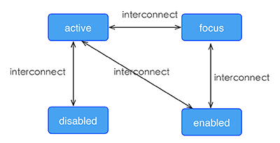
+## Pseudo class <span class="api-version">v0.9.5+</span>
-## transition <Badge text="0.16+" type="warn" vertical="middle"/>
+Weex support four pseudo-classes: `active`, `focus`, `disabled`, `enabled`
-现在您可以在 CSS 中使用 `transition` 属性来提升您应用的交互性与视觉感受,`transition` 中包括布局动画,即 LayoutAnimation,现在布局产生变化的同时也能使用 `transition` 带来的流畅动画。`transition`允许 CSS 的属性值在一定的时间区间内平滑地过渡。
+All components support `active`, but only the input component and the textarea component support `focus`, `enabled`, `diabled`.
-### 参数
+### Rule
-- ``transition-property``:设置过渡动画的属性名,设置不同样式 `transition` 效果的键值对,默认值为空,表示不执行任何过渡效果,下表列出了所有合法的参数属性:
+- the high priority override low priority when rules take effect at the same time
-| 参数名 | 描述 |
-| --------------- | ------------------------------ |
-| `width` | 设置组件的宽度参与过渡动画 |
-| `height` | 设置组件的高度参与过渡动画 |
-| `top` | 设置组件的顶部距离参与过渡动画 |
-| `bottom` | 设置组件的底部距离参与过渡动画 |
-| `left` | 设置组件的左侧距离参与过渡动画 |
-| `right` | 设置组件的右侧距离参与过渡动画 |
-| `background-color` | 设置组件的背景颜色参与过渡动画 |
-| `opacity` | 设置组件的不透明度参与过渡动画 |
-| `transform` | 设置组件的变换类型参与过渡动画 |
+ - such as: "input:active:enabled" will override "input:active"
-- `transition-duration`:指定过渡的持续时间 (单位是毫秒),默认值是 `0`,表示没有动画效果。
+- the interconnection rule as follow
-- `transition-delay`:指定请求过渡操作到执行过渡之间的时间间隔 (单位是毫秒或者秒),默认值是 `0`,表示没有延迟,在请求后立即执行过渡。
+ 
-- `transition-timing-function`:描述过渡执行的速度曲线,用于使过渡更为平滑。默认值是 `ease`。下表列出了所有合法的属性:
-
-| 属性名 | 描述 |
-| ------------------------------ | ---------------------------------------- |
-| ease | transition 过渡逐渐变慢的过渡效果 |
-| ease-in | transition 过渡慢速开始,然后变快的过渡效果 |
-| ease-out | transition 过渡快速开始,然后变慢的过渡效果 |
-| ease-in-out | transition 过渡慢速开始,然后变快,然后慢速结束的过渡效果 |
-| linear | transition 过渡以匀速变化 |
-| cubic-bezier(x1, y1, x2, y2) | 使用三阶贝塞尔函数中自定义 transition 变化过程,函数的参数值必须处于 0 到 1 之间。更多关于三次贝塞尔的信息请参阅 [cubic-bezier](http://cubic-bezier.com/) 和 [Bézier curve](https://en.wikipedia.org/wiki/B%C3%A9zier_curve). |
-
-### 示例
+### Example
```html
+<template>
+ <div class="wrapper">
+ <image :src="logoUrl" class="logo"></image>
+ </div>
+</template>
+
<style scoped>
- .panel {
- margin: 10px;
- top:10px;
+ .wrapper {
align-items: center;
- justify-content: center;
- border: solid;
- border-radius: 10px;
- transition-property: width, height, background-color;
- transition-duration: 0.3s;
- transition-delay: 0s;
- transition-timing-function: cubic-bezier(0.25, 0.1, 0.25, 1.0);
+ margin-top: 120px;
+ }
+ .title {
+ font-size: 48px;
+ }
+ .logo {
+ width: 360px;
+ height: 82px;
+ background-color: red;
+ }
+ .logo:active {
+ width: 180px;
+ height: 82px;
+ background-color: green;
}
</style>
-```
-
-## 伪类 <Badge text="0.9.5" type="warn" vertical="middle"/>
-
-Weex 支持四种伪类:`active`, `focus`, `disabled`, `enabled`
-所有组件都支持 `active`, 但只有 `input` 组件和 `textarea` 组件支持 `focus`, `enabled`, `disabled`。
-
-### 规则
-
-- 同时生效的时候,优先级高覆盖优先级低
-
- - 例如:`input:active:enabled` 和 `input:active` 同时生效,前者覆盖后者
-
-- 互联规则如下所示
+<script>
+ export default {
+ props: {
+ logoUrl: {
+ default: 'https://alibaba.github.io/weex/img/weex_logo_blue@3x.png'
+ },
+ target: {
+ default: 'World'
+ }
+ },
+ methods: {
+ update (e) {
+ this.target = 'Weex';
+ }
+ }
+ };
+</script>
+```
- 
+[Try it](http://dotwe.org/vue/df2c8f254620d6d30d0906ee75fe5b99)
-[示例](http://dotwe.org/vue/df2c8f254620d6d30d0906ee75fe5b99)
+## Linear-gradient <span class="api-version">v0.10+</span>
-## 线性渐变 <Badge text="0.10+" type="warn" vertical="middle"/>
+Weex support linear-gradient background, You can see [W3C description of the gradient](https://developer.mozilla.org/en-US/docs/Web/CSS/CSS_Images/Using_CSS_gradients).
-Weex 支持线性渐变背景,具体介绍可参考 [CSS 渐变介绍](https://developer.mozilla.org/zh-CN/docs/Web/Guide/CSS/Using_CSS_gradients)。
+### Supported components
-所有组件均支持线性渐变。
+All components in Weex support gradients
-### 使用
+### Usage
-你可以通过 `background-image` 属性创建线性渐变。
+You can use linear gradient by `background-image` property.
```css
-background-image: linear-gradient(to top, #a80077, #66ff00);
+background-image: linear-gradient(to top,#a80077,#66ff00);
```
-目前暂不支持 `radial-gradient`(径向渐变)。
+`radial-gradient` is not currently supported, do not use it.
-Weex 目前只支持两种颜色的渐变,渐变方向如下:
+Weex currently supports two color gradients. The direction of the gradient is as follows:
-- `to right`:从左向右渐变
-- `to left`:从右向左渐变
-- `to bottom`:从上到下渐变
-- `to top`:从下到上渐变
-- `to bottom right`:从左上角到右下角
-- `to top left`:从右下角到左上角
+* to right
+ From left to right
+* to left
+ From right to left
+* to bottom
+ From top to bottom
+* to top
+ From bottom to top
+* to bottom right
+ From the upper left corner to the lower right corner
+* to top left
+ From the lower right corner to the upper left corner
-::: warning
-- `background-image` 优先级高于 `background-color`,这意味着同时设置 `background-image` 和 `background-color`,`background-color` 被覆盖。
-- `background` 不支持简写。
-:::
-
-[示例](http://dotwe.org/vue/5ca46fdb8520e5a1255533d390d41f63)
+### Note
-## 阴影(box-shadow) <Badge text="0.11+" type="warn" vertical="middle"/>
+- `background-image` and `background-color` are set at the same time, `background-image` precedes `background-color`.
+- Do not use shorthand property such as `background`.
-Weex 支持 `box-shadow` 属性用于设置元素阴影。
+### Example
-### 注意
-
-::: warning
-- 目前仅 iOS 支持 `box-shadow` 属性,Android 暂不支持,可以使用图片代替。
-- 每个元素只支持设置一个阴影效果,不支持多个阴影同时作用于一个元素。
-:::
-
-### 参数
-
-- `inset`(可选)
-
- 默认阴影在边框外。使用 `inset` 后,阴影在边框内(即使是透明边框),背景之上内容之下。
-
-- `<offset-x>`
+```html
+<template>
+ <scroller style="background-color: #3a3a3a">
+ <div class="container1" style="background-image:linear-gradient(to right,#a80077,#66ff00);">
+ <text class="direction">to right</text>
+ </div>
+ <div class="container1" style="background-image:linear-gradient(to left,#a80077,#66ff00);">
+ <text class="direction">to left</text>
+ </div>
+ <div class="container1" style="background-image:linear-gradient(to bottom,#a80077,#66ff00);">
+ <text class="direction">to bottom</text>
+ </div>
+ <div class="container1" style="background-image:linear-gradient(to top,#a80077,#66ff00);">
+ <text class="direction">to top</text>
+ </div>
+ <div style="flex-direction: row;align-items: center;justify-content: center">
+ <div class="container2" style="background-image:linear-gradient(to bottom right,#a80077,#66ff00);">
+ <text class="direction">to bottom right</text>
+ </div>
+ <div class="container2" style="background-image:linear-gradient(to top left,#a80077,#66ff00);">
+ <text class="direction">to top left</text>
+ </div>
+ </div>
+ </scroller>
+</template>
+<style>
+ .container1 {
+ margin: 10px;
+ width: 730px;
+ height: 200px;
+ align-items: center;
+ justify-content: center;
+ border: solid;
+ border-radius: 10px;
+ }
- `px` 单位长度值,用来设置阴影偏移量。`<offset-x>` 设置水平偏移量,如果是负值则阴影位于元素左边。 `<offset-y>` 设置垂直偏移量,如果是负值则阴影位于元素上面。如果两者都是 0,那么阴影位于元素后面。这时如果设置了 `<blur-radius>` 或 `<spread-radius>` 则有模糊效果。
+ .container2 {
+ margin: 10px;
+ width: 300px;
+ height: 300px;
+ align-items: center;
+ justify-content: center;
+ border: solid;
+ border-radius: 10px;
+ }
-- `<offset-y>`
+ .direction {
+ font-size: 40px;
+ color: white;
+ }
+</style>
+```
- `px` 单位长度值,用来设置阴影偏移量。`<offset-x>` 设置水平偏移量,如果是负值则阴影位于元素左边。 `<offset-y>` 设置垂直偏移量,如果是负值则阴影位于元素上面。如果两者都是 0,那么阴影位于元素后面。这时如果设置了 `<blur-radius>` 或 `<spread-radius>` 则有模糊效果。
+## Box-shadow <span class="api-version">v0.11+</span>
-- `<blur-radius>`
+Weex supports box-shadow in iOS: `inset`,`offset-x`,`offset-y`, `blur-radius`,`color`
- 设置模糊半径,`px` 单位长度值,值越大,模糊面积越大,阴影就越大越淡。不能为负值。默认为0,此时阴影边缘锐利。
-- `<color>`
+:::danger
+box-shadow takes effect on Android
+:::
- 设置阴影颜色,可参考 [CSS 颜色单位](./css-units.html#css-颜色单位)。
+### Example
-[示例](http://dotwe.org/vue/bc0324f47ea425f89d0e5102801ee856)
+```html
+<template>
+ <div class="wrapper">
+ <div style="width:400px; height:60px;background-color: #FFE4C4; box-shadow:20px 10px rgb(255, 69, 0);">
+ <text class="title" style="text-align: center">Hello {{target}}</text>
+ </div>
+ <div style="margin-top: 80px;width:400px; height:60px;background-color: #FFE4C4; box-shadow: 20px 10px 5px rgba(255, 69, 0, 0.8);">
+ <text class="title" style="text-align: center">Hello {{target}}</text>
+ </div>
+ <div style="margin-top: 80px;width:400px; height:60px;background-color: #FFE4C4; box-shadow:inset 20px 10px 5px rgba(255, 69, 0, 0.8);">
+ <text class="title" style="text-align: center">Hello {{target}}</text>
+ </div>
+ <div style="margin-top: 80px;width:400px; height:60px;background-color: #FFE4C4; box-shadow:inset 20px 10px 5px rgb(255, 69, 0);">
+ <text class="title" style="text-align: center">Hello {{target}}</text>
+ </div>
+ <div style="margin-top: 80px;width:400px; height:60px;background-color: #FFE4C4; box-shadow:20px 10px 5px black;">
+ <text class="title" style="text-align: center">Hello {{target}}</text>
+ </div>
+ <div style="margin-top: 80px;width:400px; height:60px;background-color: #FFE4C4; box-shadow:20px 10px 5px #008B00;">
+ <text class="title" style="text-align: center">Hello {{target}}</text>
+ </div>
+ </div>
+</template>
-## 其他基本样式
+<style scoped>
+ .wrapper {align-items: center; margin-top: 120px;}
+ .title {font-size: 48px;}
+</style>
-- `opacity {number}`:取值范围为 [0, 1] 区间。默认值是 1,即完全不透明;0 是完全透明;0.5 是 50% 的透明度。
-- `background-color {color}`:设定元素的背景色,可选值为色值,支持RGB( `rgb(255, 0, 0)` );RGBA( `rgba(255, 0, 0, 0.5)` );十六进制( `#ff0000` );精简写法的十六进制( `#f00` );色值关键字(`red`),默认值是 `transparent` 。
+<script>
+ module.exports = {
+ data: function () {
+ return {
+ logoUrl: 'https://alibaba.github.io/weex/img/weex_logo_blue@3x.png',
+ target: 'World'
+ };
+ }
+ };
+</script>
+```
-**注意:** [色值的关键字列表](./css-units.html#颜色关键字列表)。
-## 上手样式
+## Other Common Style
+* `opacity {number}`:Set the transparency of an element or the degree to which content behind an element is visible. The {number} range is **0** to **1**, **0** for fully transparent and **1** for fully opaque.
+* `background-color {color}`: Set the background color of an element. The following color format is supported.
+ * RGB, e.g. `rgb(250, 0, 0)`
+ * RGBA, e.g. `rgba(255, 0, 0, 0.5)`
+ * Hexadecimal color e.g. `#ff0000` or `#f00`
+ * Keywords, include [basic keywords](https://drafts.csswg.org/css-color-3/#html4) and [extends keywords](https://drafts.csswg.org/css-color-3/#svg-color)
-如果对于样式写法需要更多上手参考,可参考每个组件的文档中,都有常见的例子可供参考。
+## Simple Step
-你可以按照以下步骤来规划 Weex 页面的样式。
+These up-to-down steps may help you to plan the whole style of weex pages.
-1. 全局样式规划:将整个页面分割成合适的模块。
-2. flex 布局:排列和对齐页面模块。
-3. 定位盒子:定位并设置偏移量。
-4. 细节样式处理:增加特定的具体样式。
+1. overall style: divide the whole page to different parts
+2. flex alignment: align boxes in every part of page
+3. position box: place box, set offset
+4. element specific style: set styles for certain element if needed
\ No newline at end of file
diff --git a/docs/zh/docs/styles/common-styles.md b/docs/zh/docs/styles/common-styles.md
index 3a45a53..398df75 100644
--- a/docs/zh/docs/styles/common-styles.md
+++ b/docs/zh/docs/styles/common-styles.md
@@ -2,6 +2,14 @@
所有 Weex 自带组件都支持以下通用样式规则。
+::: danger
+Weex所支持的通用样式已在本文档中全部列出,一些组件可能有自定义样式,请参考组件文档。除此之外的属性,均不被支持。
+:::
+
+::: warning
+Weex 对于长度值目前只支持像素值,不支持相对单位(`em`、`rem`)。
+:::
+
## 盒模型
Weex 盒模型基于 [CSS 盒模型](https://developer.mozilla.org/zh-CN/docs/Web/CSS/CSS_Box_Model/Introduction_to_the_CSS_box_model),每个 Weex 元素都可视作一个盒子。我们一般在讨论设计或布局时,会提到「盒模型」这个概念。
@@ -11,137 +19,131 @@ Weex 盒模型基于 [CSS 盒模型](https://developer.mozilla.org/zh-CN/docs/We
盒模型描述了一个元素所占用的空间。每一个盒子有四条边界:外边距边界 margin edge, 边框边界 border edge, 内边距边界 padding edge 与内容边界 content edge。这四层边界,形成一层层的盒子包裹起来,这就是盒模型大体上的含义。
::: warning
-- Weex 对于长度值目前只支持像素值,不支持相对单位(`em`、`rem`)。
-- **Weex 盒模型的 box-sizing 默认为 border-box,即盒子的宽高包含内容、内边距和边框的宽度,不包含外边距的宽度。**
+Weex 盒模型的 box-sizing 默认为 border-box,即盒子的宽高包含内容、内边距和边框的宽度,不包含外边距的宽度。
:::
-### 属性
-
-#### 宽度
-
-`width {length}`:默认值 0
-
-#### 高度
-
-`height {length}`:默认值 0
-
-#### 内边距
-
-`padding {length}`:内边距,内容和边框之间的距离,默认值 0。与标准 CSS 类似,`padding` 支持简写,也可分解为以下四个:
- - `padding-left {length}`:左内边距,默认值 0
- - `padding-right {length}`:右内边距,默认值 0
- - `padding-top {length}`:上内边距,默认值 0
- - `padding-bottom {length}`:下内边距,默认值 0
-
-```css
-.content {
- /* 应用于四个边 */
- padding: 10px;
-
- /* 垂直方向| 水平方向*/
- padding: 5px 10px;
-
- /* 顶部| 水平方向| 底部*/
- padding: 1px 2px 2px;
-
- /* 顶部| 右边| 底部| 左边*/
- padding: 2px 1px 0px 1px;
-}
-```
-
-#### 外边距
-
-`margin {length}`:外边距,元素和元素之间的空白距离,默认值 0。与标准 CSS 类似,`margin` 支持简写,也可分解为以下四个:
- - `margin-left {length}`:左外边距,默认值 0
- - `margin-right {length}`:右外边距,默认值 0
- - `margin-top {length}`:上外边距,默认值 0
- - `margin-bottom {length}`:下外边距,默认值 0
-
-```css
-.content {
- /* 应用于四个边 */
- margin: 10px;
-
- /* 垂直方向| 水平方向*/
- margin: 5px 10px;
+::: warning
+Weex 只支持 `overflow:hidden`.
+:::
- /* 顶部| 水平方向| 底部*/
- margin: 1px 2px 2px;
+下面的例子显示了盒模型的基本用法
- /* 顶部| 右边| 底部| 左边*/
- margin: 2px 1px 0px 1px;
-}
+```html
+<template>
+ <div>
+ <image src="..." style="width: 400; height: 200; margin-left: 20;"></image>
+ </div>
+</template>
```
-#### 边框
-
-**设置元素边框暂不支持类似** `border: 1 solid #ff0000;` **的组合写法**。需分别设置 `border-width`(边框宽度),`border-style`(边框样式)和 `border-color`(边框颜色)。
+### 宽度
-- `border-style {string}`:统一设定四个方向的边框样式,值类型为 `string`,**不支持简写**,可选值为:
- - `solid`:实线边框,默认值 `solid`
- - `dashed`:方形虚线边框
- - `dotted`:圆点虚线边框
-
- 如果四个方向的边框样式不同,可分别设置:
-
- - `border-left-style {string}`:可选值为 `solid` | `dashed` | `dotted`,默认值 `solid`
- - `border-top-style {string}`:可选值为 `solid` | `dashed` | `dotted`,默认值 `solid`
- - `border-right-style {string}`:可选值为 `solid` | `dashed` | `dotted`,默认值 `solid`
- - `border-bottom-style {string}`:可选值为 `solid` | `dashed` | `dotted`,默认值 `solid`
+`width {length}`:默认值 0
-- `border-width {length}`:统一设定四个方向的边框宽度,非负值, 默认值 0,**不支持简写**,如果四个方向的边框宽度不同,可分别设置:
+### 高度
- - `border-left-width {length}`:非负值, 默认值 0
- - `border-top-width {length}`:非负值, 默认值 0
- - `border-right-width {length}`:非负值, 默认值 0
- - `border-bottom-width {length}`:非负值, 默认值 0
+`height {length}`:默认值 0
-- `border-color {color}`:统一设定四个方向的设定边框颜色,默认值 `#000000`,**不支持简写**,如果四个方向的边框颜色不同,可分别设置:
+### 内边距
+`padding {length}`:内边距,内容和边框之间的距离,默认值 0。与标准 CSS 类似,`padding` 支持简写,也可分解为以下四个:
+ * `padding {length}`: 上、下、左、右四边内边距,默认值 0
+ * `padding-left {length}`:左内边距,默认值 0
+ * `padding-right {length}`:右内边距,默认值 0
+ * `padding-top {length}`:上内边距,默认值 0
+ * `padding-bottom {length}`:下内边距,默认值 0
+
+### 边框
+#### border-style
+`border-width`设定边框样式,如果四个方向的边框样式不同,可分别设置:
+ * `border-style {string}`
+ * `border-left-style {string}`:可选值为 `solid` | `dashed` | `dotted`,默认值 `solid`
+ * `border-top-style {string}`:可选值为 `solid` | `dashed` | `dotted`,默认值 `solid`
+ * `border-right-style {string}`:可选值为 `solid` | `dashed` | `dotted`,默认值 `solid`
+ * `border-bottom-style {string}`:可选值为 `solid` | `dashed` | `dotted`,默认值 `solid`
+
+支持的值如下:
+ * `solid`:实线边框,默认值 `solid`
+ * `dashed`:方形虚线边框
+ * `dotted`:圆点虚线边框
+
+#### border-width
+`border-width`:设定边框宽度,非负值, 默认值 0,如果四个方向的边框宽度不同,可分别设置:
+ * `border-left-width {length}`:非负值, 默认值 0
+ * `border-left-width {length}`:非负值, 默认值 0
+ * `border-top-width {length}`:非负值, 默认值 0
+ * `border-right-width {length}`:非负值, 默认值 0
+ * `border-bottom-width {length}`:非负值, 默认值 0
+
+#### border-color
+`border-color`:设定边框颜色,默认值 `#000000`,如果四个方向的边框颜色不同,可分别设置:
+ * `border-color {color}`:默认值 `#000000`
+ * `border-left-color {color}`:默认值 `#000000`
+ * `border-top-color {color}`:默认值 `#000000`
+ * `border-right-color {color}`:默认值 `#000000`
+ * `border-bottom-color {color}`:默认值 `#000000`
+
+#### border-radius
+`border-radius`:设置边框的圆角,默认值 0,如果四个方向的圆角弧度不同,可分别设置:
+ * `border-radius {length}`: 非负值, 默认值 0
+ * `border-bottom-left-radius {length}`:非负值, 默认值 0
+ * `border-bottom-right-radius {length}`:非负值, 默认值 0
+ * `border-top-left-radius {length}`:非负值, 默认值 0
+ * `border-top-right-radius {length}`:非负值, 默认值 0
+
+::: danger
+`border-radius`和`border-width`定义了圆心角为90度的椭圆弧的长轴和半长轴的大小。如果邻接两边`border-radius`(或`border-width`不一致,weex绘制的边框曲线可能不够平滑。
+:::
- - `border-left-color {color}`:默认值 `#000000`
- - `border-top-color {color}`:默认值 `#000000`
- - `border-right-color {color}`:默认值 `#000000`
- - `border-bottom-color {color}`:默认值 `#000000`
+::: danger Android 兼容性
+尽管 `overflow: hidden` 在 Android 上是默认行为,但只有下列条件都满足时,一个父 view 才会去剪切它的子 view。
+ * 父view是 `div`, `a`, `cell`, `refresh` 或 `loading`。
+ * 系统版本是 Android 4.3 或更高。
+ * 系统版本不是 Andorid 7.0。
+ * 父 view 没有 `background-image` 属性或系统版本是 Android 5.0 或更高。
+:::
-- `border-radius {length}`:统一设定四个方向的圆角,默认值 0,**不支持简写**,如果四个方向的圆角弧度不同,可分别设置:
+### 外边距
+`margin {length}`:外边距,元素和元素之间的空白距离,默认值 0。与标准 CSS 类似,`margin` 支持简写,也可分解为四边:
+ * `margin {length}`: 上、下、左、右四边外边距,默认值 0
+ * `margin-left {length}`:左外边距,默认值 0
+ * `margin-right {length}`:右外边距,默认值 0
+ * `margin-top {length}`:上外边距,默认值 0
+ * `margin-bottom {length}`:下外边距,默认值 0
- - `border-bottom-left-radius {length}`:非负值, 默认值 0
- - `border-bottom-right-radius {length}`:非负值, 默认值 0
- - `border-top-left-radius {length}`:非负值, 默认值 0
- - `border-top-right-radius {length}`:非负值, 默认值 0
+## Flexbox
+Weex 布局模型基于 CSS [`Flexbox`](http://www.w3.org/TR/css3-flexbox/),以便所有页面元素的排版能够一致可预测,同时页面布局能适应各种设备或者屏幕尺寸。Flexbox 包含 flex 容器和 flex 成员项。如果一个 Weex 元素可以容纳其他元素,那么它就成为 flex 容器。
::: warning
-- 目前在 `<image>` 组件上尚无法只定义一个或几个角的 `border-radius`,比如你无法在这个组件上使用 `border-top-left-radius`,该约束只对 iOS 生效,Android 并不受此限制。
-
-- 尽管 `overflow: hidden` 在 Android 上是默认行为,但只有下列条件都满足时,一个父 view 才会去剪切它的子 view。这个限制只对 Android 生效,iOS 不受影响:
-
- - 父view是 `div`, `a`, `cell`, `refresh` 或 `loading`。
- - 系统版本是 Android 4.3 或更高。
- - 系统版本不是 Andorid 7.0。
- - 父 view 没有 `background-image` 属性或系统版本是 Android 5.0 或更高。
+文档中未说明的 flexbox 属性均不支持:如 `order`、`flex-flow` 等。
:::
-## Flexbox
-
-Weex 布局模型基于 CSS [`Flexbox`](http://www.w3.org/TR/css3-flexbox/),以便所有页面元素的排版能够一致可预测,同时页面布局能适应各种设备或者屏幕尺寸。
-
-Flexbox 包含 flex 容器和 flex 成员项。如果一个 Weex 元素可以容纳其他元素,那么它就成为 flex 容器。需要注意的是,flexbox 的老版规范相较新版有些出入,比如是否能支持 wrapping。这些都描述在 W3C 的工作草案中了,你需要注意下新老版本之间的不同。另外,老版本只在安卓 4.4 版以下得到支持。
-
### Flex 容器
-
在 Weex 中,Flexbox 是默认且唯一的布局模型,所以你不需要手动为元素添加 `display: flex;` 属性。
-- `flex-direction`:
+#### direction
+`direction`决定了文字方向和**Flex容器**的基线方向。默认值为`ltr`。
+* `ltr`: 文字和其他元素从左到右排布
+* `rtl`: 文字和其他元素从右到左排布。
- 定义了 flex 容器中 flex 成员项的排列方向。可选值为 `row` | `column`,默认值为 `column`
-
- - `column`:从上到下排列。
- - `row`:从左到右排列。
-
-- `justify-content`:
-
- 定义了 flex 容器中 flex 成员项在主轴方向上如何排列以处理空白部分。可选值为 `flex-start` | `flex-end` | `center` | `space-between`,默认值为 `flex-start`。
+:::tip
+尽管 `direction` 不是 Flexbox模型的一部分,但却对 Flexbox 模型有着影响。
+:::
+#### flex-direction
+`flex-direction`定义了 flex 容器中 flex 成员项的排列方向,默认值为 `column`
+ * `column`:从上到下排列。
+ * `column-reverse`: 从下到上排布
+ * `row`:如果存在`direction:ltr`,则从左到右排布;如果存在`direction:rtl`,则从右到左排布。
+ * `row-reverse`: 排布方向与`flex-direction:row`相反
+
+#### flex-wrap
+`flex-wrap`属性决定了`Flex成员项`在一行还是多行分布,默认值为`nowrap`
+* `nowrap`: `Flex成员项`在一行排布,排布的开始位置由`direction`指定。
+* `wrap`:` Flex成员项`在多行排布,排布的开始位置由`direction`指定
+* `wrap-reverse`: 行为类似于`wrap`,排布方向与其相反。
+
+#### justify-content
+定义了 flex 容器中 flex 成员项在主轴方向上如何排列以处理空白部分。可选值为 `flex-start` | `flex-end` | `center` | `space-between`,默认值为 `flex-start`。
- `flex-start`:是默认值,所有的 flex 成员项都排列在容器的前部;
- `flex-end`:则意味着成员项排列在容器的后部;
- `center`:即中间对齐,成员项排列在容器中间、两边留白;
@@ -151,10 +153,8 @@ Flexbox 包含 flex 容器和 flex 成员项。如果一个 Weex 元素可以容
<img width="400px" src="https://img.alicdn.com/tfs/TB1fQRmohnaK1RjSZFBXXcW7VXa-504-270.svg" />
</div>
-- `align-items`:
-
- 定义了 flex 容器中 flex 成员项在纵轴方向上如何排列以处理空白部分。可选值为 `stretch` | `flex-start` | `center` | `flex-end`,默认值为 `stretch`。
-
+#### align-items
+定义了 flex 容器中 flex 成员项在纵轴方向上如何排列以处理空白部分。可选值为 `stretch` | `flex-start` | `center` | `flex-end`,默认值为 `stretch`。
- `stretch` 是默认值,即拉伸高度至 flex 容器的大小;
- `flex-start` 则是上对齐,所有的成员项排列在容器顶部;
- `flex-end` 是下对齐,所有的成员项排列在容器底部;
@@ -165,43 +165,17 @@ Flexbox 包含 flex 容器和 flex 成员项。如果一个 Weex 元素可以容
</div>
### Flex 成员项
-
+#### flex
flex 属性定义了 flex 成员项可以占用容器中剩余空间的大小。如果所有的成员项设置相同的值 `flex: 1`,它们将平均分配剩余空间。如果一个成员项设置的值为 `flex: 2`,其它的成员项设置的值为 `flex: 1`,那么这个成员项所占用的剩余空间是其它成员项的 2 倍。Flex 成员项暂不支持 `flex-shrink` 和 `flex-basis` 属性。
-
- `flex {number}`:值为 number 类型。**该属性不支持 `flex: <flex-grow> | <flex-shrink> | <'flex-basis>`** 的简写。
示例,使用 flexbox 实现水平居中与垂直居中:
-```html
-<template>
- <div class="wrapper">
- <div class="box">
- </div>
- </div>
-</template>
+### Examples
+* [水平和竖直居中](http://dotwe.org/vue/505b5e8bdb6774bccb597a30f74492af)
+* [Grid布局](http://dotwe.org/vue/4e1dcb58b31c266c4979fcbed04bb25b)
+* [等高模块](http://dotwe.org/vue/5aa2fa9a1ed5ea250e553683ca710f7a)
-<style scoped>
- .wrapper {
- position: absolute;
- top: 0;
- right: 0;
- bottom: 0;
- left: 0;
- background-color: #cccccc;
- justify-content: center;
- align-items: center;
- }
- .box {
- width: 200px;
- height: 200px;
- background-color: #fc0000;
- }
-</style>
-```
-
-::: warning
-文档中未说明的 flexbox 属性均不支持:如 `order`、`flex-flow` 等。
-:::
## 定位
@@ -228,55 +202,7 @@ Weex 支持 `position` 定位,用法与 CSS position 类似。为元素设置
[示例](http://dotwe.org/vue/cb3436ea65283d2ab456641ba30133a4)
-## transform
-
-transform 属性向元素应用 2D 转换。该属性允许我们对元素进行旋转、缩放、移动或倾斜。
-
-目前支持的 transform 声明格式:
-
-- `translateX({<length/percentage>})`:X 轴方向平移,支持长度单位或百分比。
-- `translateY({<length/percentage>})`:Y 轴方向平移,支持长度单位或百分比。
-- `translate({<length/percentage>} {<length/percentage>})`:X 轴和 Y 轴方向同时平移,`translateX` + `translateY` 简写。
-- `scaleX(<number>)`:X 轴方向缩放,值为数值,表示缩放比例,**不支持百分比**。
-- `scaleY(<number>)`:Y 轴方向缩放,值为数值,表示缩放比例,**不支持百分比**。
-- `scale(<number>)`:X 轴和 Y 轴方向同时缩放,`scaleX` + `scaleY` 简写。
-- `rotate(<angle/degree>)`:将元素围绕一个定点(由 `transform-origin` 属性指定)旋转而不变形的转换。指定的角度定义了旋转的量度。若角度为正,则顺时针方向旋转,否则逆时针方向旋转。
-- `rotateX(<angle/degree>)`<Badge text="0.14+" type="warn" vertical="middle"/>:X 轴方向的旋转。
-- `rotateY(<angle/degree>)`<Badge text="0.14+" type="warn" vertical="middle"/>:Y 轴方向的旋转。
-- `perspective(<length>)`<Badge text="0.16+" type="warn" vertical="middle"/>:指定了观察者与 z=0 平面的距离,使具有三维位置变换的元素产生透视效果。z>0 的三维元素比正常大,而 z<0 时则比正常小,大小程度由该属性的值决定。**Android 4.1及以上版本支持**。详情可参考 [MDN 介绍](https://developer.mozilla.org/zh-CN/docs/Web/CSS/perspective)。
-- `transform-origin {length/percentage/关键字(top/left/right/bottom)}:`:设置一个元素变形的原点,**仅支持 2D 坐标**。
-
-### 示例
-
-```HTML
-<template>
- <div class="wrapper">
- <div class="transform">
- <text class="title">Transformed element</text>
- </div>
- </div>
-</template>
-
-<style>
- .transform {
- align-items: center;
- transform: translate(150px, 200px) rotate(20deg);
- transform-origin: 0 -250px;
- border-color:red;
- border-width:2px;
- }
- .title {font-size: 48px;}
-</style>
-```
-
-::: warning
-在 native 端,给组件设置 `transform` 变换后,如果需要恢复原效果,不能直接删除对应的 `transform` 属性,而需要重新设置一个 `transform` 将元素变换恢复。可对比以下两个示例:
-
-- [手动恢复](http://dotwe.org/vue/2c800bd791ce68860981bb6f611ce2aa)
-- [直接删除 transform](http://dotwe.org/vue/020c00fd633711107fd2b3cedd5018db)
-:::
-
-## transition <Badge text="0.16+" type="warn" vertical="middle"/>
+## Transition <Badge text="0.16+" type="warn" vertical="middle"/>
现在您可以在 CSS 中使用 `transition` 属性来提升您应用的交互性与视觉感受,`transition` 中包括布局动画,即 LayoutAnimation,现在布局产生变化的同时也能使用 `transition` 带来的流畅动画。`transition`允许 CSS 的属性值在一定的时间区间内平滑地过渡。
@@ -330,6 +256,55 @@ transform 属性向元素应用 2D 转换。该属性允许我们对元素进行
</style>
```
+## Transform
+::: tip
+除了`perspective`和`transform-origin`,`transition`支持了`transform`的全部能力。
+:::
+
+目前支持的 transform 声明格式:
+
+- `translateX({<length/percentage>})`:X 轴方向平移,支持长度单位或百分比。
+- `translateY({<length/percentage>})`:Y 轴方向平移,支持长度单位或百分比。
+- `translate({<length/percentage>} {<length/percentage>})`:X 轴和 Y 轴方向同时平移,`translateX` + `translateY` 简写。
+- `scaleX(<number>)`:X 轴方向缩放,值为数值,表示缩放比例,**不支持百分比**。
+- `scaleY(<number>)`:Y 轴方向缩放,值为数值,表示缩放比例,**不支持百分比**。
+- `scale(<number>)`:X 轴和 Y 轴方向同时缩放,`scaleX` + `scaleY` 简写。
+- `rotate(<angle/degree>)`:将元素围绕一个定点(由 `transform-origin` 属性指定)旋转而不变形的转换。指定的角度定义了旋转的量度。若角度为正,则顺时针方向旋转,否则逆时针方向旋转。
+- `rotateX(<angle/degree>)`<Badge text="0.14+" type="warn" vertical="middle"/>:X 轴方向的旋转。
+- `rotateY(<angle/degree>)`<Badge text="0.14+" type="warn" vertical="middle"/>:Y 轴方向的旋转。
+- `perspective(<length>)`<Badge text="0.16+" type="warn" vertical="middle"/>:指定了观察者与 z=0 平面的距离,使具有三维位置变换的元素产生透视效果。z>0 的三维元素比正常大,而 z<0 时则比正常小,大小程度由该属性的值决定。**Android 4.1及以上版本支持**。详情可参考 [MDN 介绍](https://developer.mozilla.org/zh-CN/docs/Web/CSS/perspective)。
+- `transform-origin {length/percentage/关键字(top/left/right/bottom)}:`:设置一个元素变形的原点,**仅支持 2D 坐标**。
+
+### 示例
+
+```HTML
+<template>
+ <div class="wrapper">
+ <div class="transform">
+ <text class="title">Transformed element</text>
+ </div>
+ </div>
+</template>
+
+<style>
+ .transform {
+ align-items: center;
+ transform: translate(150px, 200px) rotate(20deg);
+ transform-origin: 0 -250px;
+ border-color:red;
+ border-width:2px;
+ }
+ .title {font-size: 48px;}
+</style>
+```
+
+::: warning
+在 native 端,给组件设置 `transform` 变换后,如果需要恢复原效果,不能直接删除对应的 `transform` 属性,而需要重新设置一个 `transform` 将元素变换恢复。可对比以下两个示例:
+
+- [手动恢复](http://dotwe.org/vue/2c800bd791ce68860981bb6f611ce2aa)
+- [直接删除 transform](http://dotwe.org/vue/020c00fd633711107fd2b3cedd5018db)
+:::
+
## 伪类 <Badge text="0.9.5" type="warn" vertical="middle"/>
Weex 支持四种伪类:`active`, `focus`, `disabled`, `enabled`