You are viewing a plain text version of this content. The canonical link for it is here.
Posted to commits@echarts.apache.org by GitBox <gi...@apache.org> on 2021/08/30 06:40:01 UTC
[GitHub] [echarts] Ovilia opened a new issue #15628: feat(transition): transition of data labels and axis labels
Ovilia opened a new issue #15628:
URL: https://github.com/apache/echarts/issues/15628
### What problem does this feature solve?
#15208 introduced trasition animation between different series, but the data labels and axis labels do not have transition right now. It would have a much better visual result if the labels can be morphed.
#### Current:
```js
var pieOption = {
series: [
{
id: 'a',
name: '访问来源',
type: 'pie',
radius: ['40%', '70%'],
avoidLabelOverlap: false,
itemStyle: {
borderRadius: 10,
borderColor: '#fff',
borderWidth: 2
},
label: {
show: true,
formatter: 'Label {b}'
},
labelLine: {
show: true
},
data: [
{value: 1048, name: 'a'},
{value: 735, name: 'b'},
{value: 580, name: 'c'},
{value: 484, name: 'd'},
{value: 300, name: 'e', groupId: 'e'}
],
universalTransition: {
enabled: true,
divideShape: 'clone'
},
animationDuration: 2000,
animationDurationUpdate: 2000
}
]
};
var barOption = {
yAxis: {
type: 'category',
data: ['a', 'b', 'c', 'd', 'e1', 'e2', 'e3'],
inverse: true
},
xAxis: {
type: 'value'
},
series: [{
id: 'a',
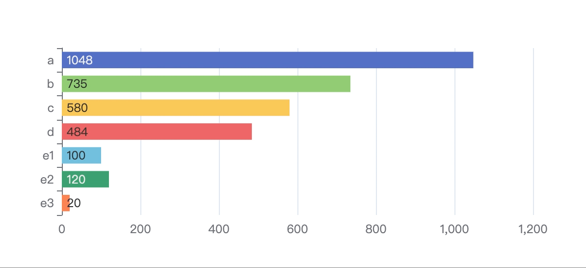
data: [
{value: 1048},
{value: 735},
{value: 580},
{value: 484},
{value: 100, groupId: 'e'},
{value: 120, groupId: 'e'},
{value: 20, groupId: 'e'}
],
label: {
show: true,
position: 'insideLeft'
},
type: 'bar',
colorBy: 'data',
universalTransition: {
enabled: true,
divideShape: 'clone'
},
animationDuration: 2000,
animationDurationUpdate: 2000
}]
};
let option = pieOption;
chart.setOption(option);
setInterval(function() {
option = option === pieOption ? barOption : pieOption;
chart.setOption(option, true);
}, 3000);
```
#### Advanced Feature Request
If possible, we may also provide `valueAnimation` from the source series to the target series. If it's not typed in number, fade out and fade in may be used.
### What does the proposed API look like?
Possibly `xAxis.axisLabel.groupId` and `series.data.label.groupId`.
<!-- This issue is generated by echarts-issue-helper. DO NOT REMOVE -->
<!-- This issue is in English. DO NOT REMOVE -->
--
This is an automated message from the Apache Git Service.
To respond to the message, please log on to GitHub and use the
URL above to go to the specific comment.
To unsubscribe, e-mail: commits-unsubscribe@echarts.apache.org
For queries about this service, please contact Infrastructure at:
users@infra.apache.org
---------------------------------------------------------------------
To unsubscribe, e-mail: commits-unsubscribe@echarts.apache.org
For additional commands, e-mail: commits-help@echarts.apache.org